Pie charts are often maligned by the data viz community. Sometimes for good reason and sometimes to just to feel better by ridiculing those that don’t know you are not supposed to use pie charts. However there are those moments where something goes truly wrong. This has to be shared to prevent it happening again. Lets this act as a warning as to what can go wrong when you use PowerPoint without a licence.This was bad enough to make it on viz.wtf.
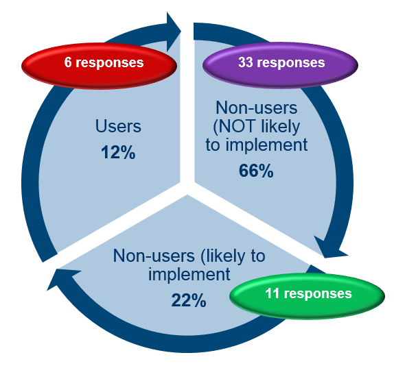
Apart from all the things wrong with this, why the arrows?


Well, for two of the arrows you could imagine a reason:
You would want to convert the non-users not likely to implement to non-users likely to implement. The non-users likely to implement you then in turn would want to convert to users.
But why would you want to lose them again to become non-users not likely to implement?