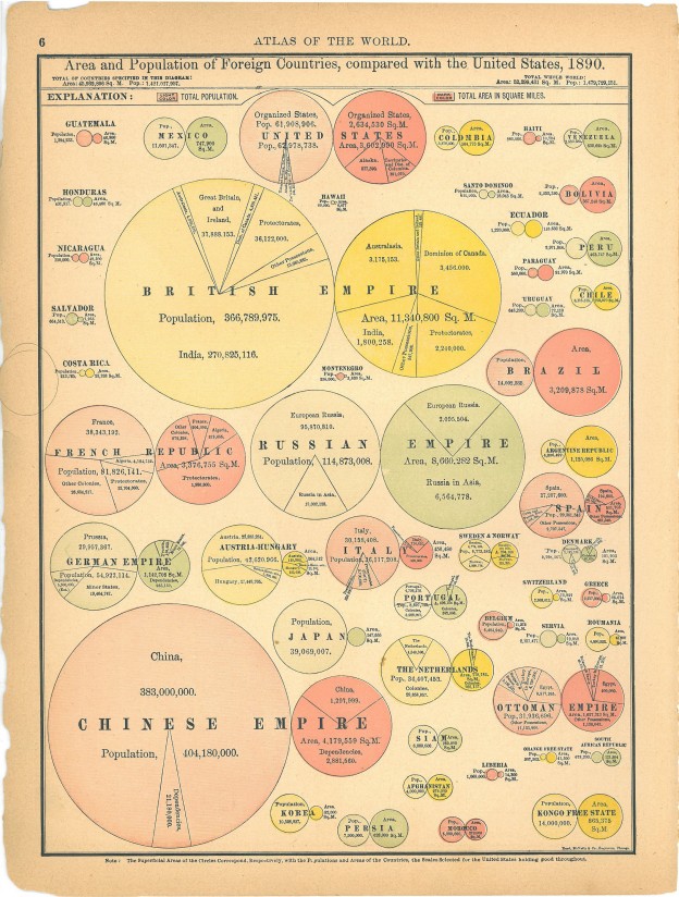
I know it seems preposterous, but data visualistion predates the the computer. Its true! There were the pioneering people who used pen and paper and had enough free fingers to do the necessary calculations since they weren’t holding onto phones. No PowerBi or Tableau in sight. It was a better time. Things took longer but there was no Neflix, so people had more time to spare. Continue reading “Really, REALLY Old Data Visualisations”
Category: Visualisation
Mapping Marriages
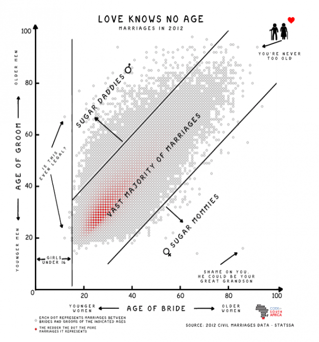
The very talented Adi Eyal created a scatter plot that shows the age distribution between men and woman when they get married. There is a big blob in the middle where the ages are similar and things get sparse towards the outlier sugar mommies and sugar daddies. Continue reading “Mapping Marriages”
Piano Tab
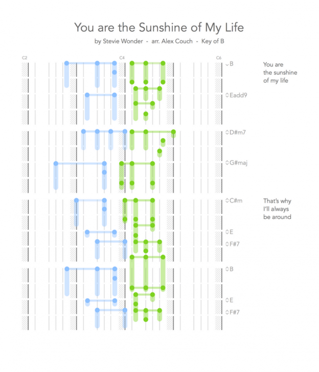
As an amateur bassist, I have taken the road frequently traveled of being able to read tab and totally intending to learn to read musical staff notation at some point. Learning piano represents a bigger hurdle though, as you need to be able to read music notation to play something that has been written done. Continue reading “Piano Tab”
The Fallen of World War II
This is an amazing data visualisation / video showing the numbers of soldiers and civilians who died during World War II. Neil manages to compress a lot of information into the visuals and helps put the relative scales into perspective nicely. It is built around a narrative of how WWII compares with where we are today and comes to a gratifying final picture. Worth taking the time to watch. There is also an interactive version available here: http://www.fallen.io/
Shazam’s huge São Tomé and Príncipe User Base
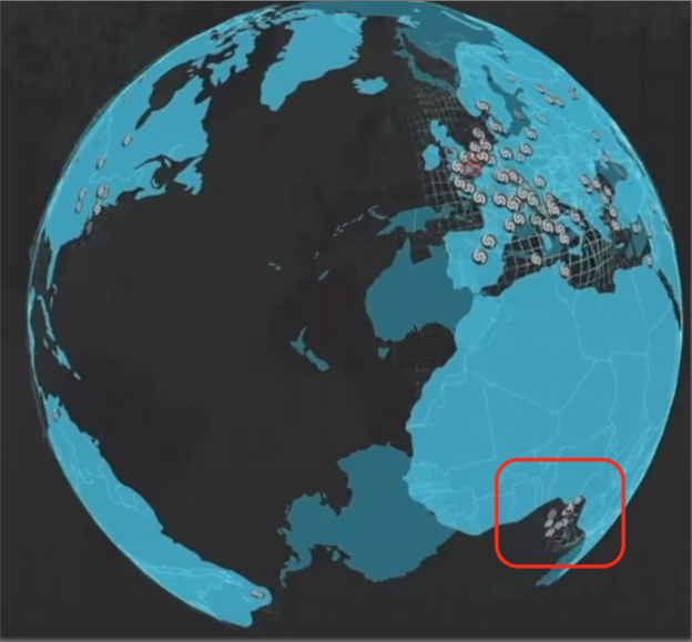
I had the pleasure of watching Cait O’Riordan speaking at last week’s Strata Hadoop in London. While she presented a fantastic talk, the one thing that struck me was a brief visualisation showing Shazam user activity around the world. Continue reading “Shazam’s huge São Tomé and Príncipe User Base”
Pie Chart Nazis
One of the things that data visualisation people like to do is point out how bad pie charts are. Its the first thing you do to show off your data viz chops. The example below from Apple being the prime candidate of a misleading pie chart. Continue reading “Pie Chart Nazis”
The Reddit Universe
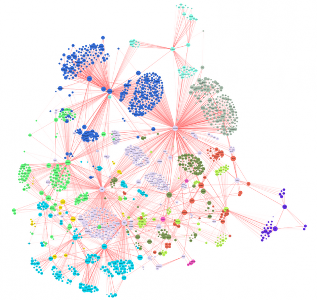
This picture of what interests reddit has been doing the rounds recently. Its a fairly large network graph showing the links between the different areas of interest of reddit users. The detail of the article is interesting on its own, but what this highlights for me is the difficulty with using large network graphs to convey information graphically. Since you have to keep zooming and moving around, you keep adding new location and context information to working memory fairly frequently, and something will fall out. Like when Homer Simpson’s took a wine making course. Continue reading “The Reddit Universe”
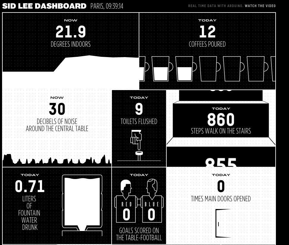
Cool new dashboard design
A colleague of mine sent me a link to a new web based dashboard designed by Sid Lee. In the book Information Dashboard Design by Stephen Few, there are many examples of how not to do it, and generally the idea of yet another dashboard does not fill me with any sense of excitement. This was one of those moments where I expected to click and run but this one really caught my eye.
While the effectiveness of the actually data communication techniques might not be as good as it could be, it is an order of magnitude more interesting to look at than the usual Excel pie chart brigade.
South Africa’s Expensive Fuel Costs
This infographic from Statista pastes a grim picture of fuel costs in South Africa. It shows that over 5% of the average South African’s salary/wages goes to fuel costs. I’m not convinced about the validity of this presentation though. The source data may be correct, but it paints a picture of expensive fuel. South Africa does not have the most expensive fuel in world, in fact its about average. This simply raises more questions. How much fuel do we buy? Do we buy a lot more than other countries? Who is buying the fuel? Does this include what you pay for riding in a taxi or on a bus? Can you separate those who own cars and therefore pay for fuel out from the list?

Cern OpenData
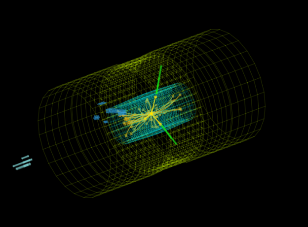
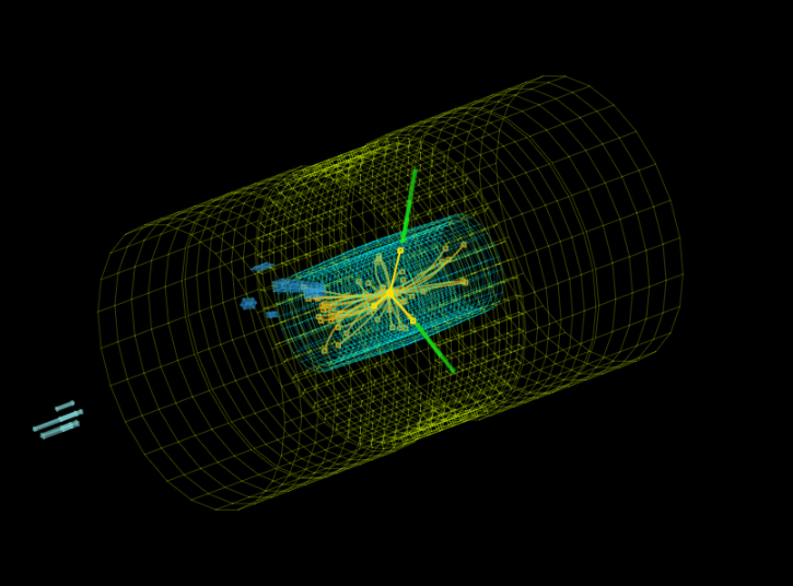
Fancy yourself as an arm chair Sheldon Cooper, or are you more of a Boson the clown? Cern have made some of the data from the LHC available via their open data project. Various data sets and visualisation engines are available along with educational material to help make a bit more sense of it. This is all available from their OpenData site.
But in the words or Homer Simpson: “There’s so much I don’t know about astrophysics. I wish I’d read that book by that wheelchair guy.”