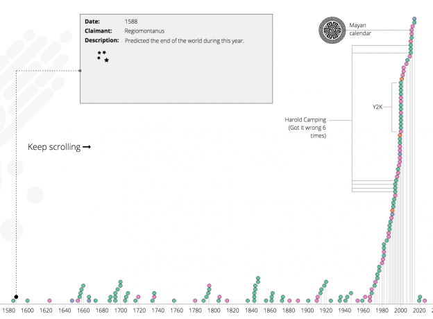
A recent Naked Data newsletter pointed me to this article on wikipedia which gives a list of when the world was predicted to end throughout recorded history. Its a timeline of when the world was supposed to end, who claimed it would and how/why. It is wikipedia, so its as accurate and complete as wikipedia can be. I figured it would be a nice thing to see on an actual timeline, so here we have it. Continue reading “A Timeline of When the World Ended”
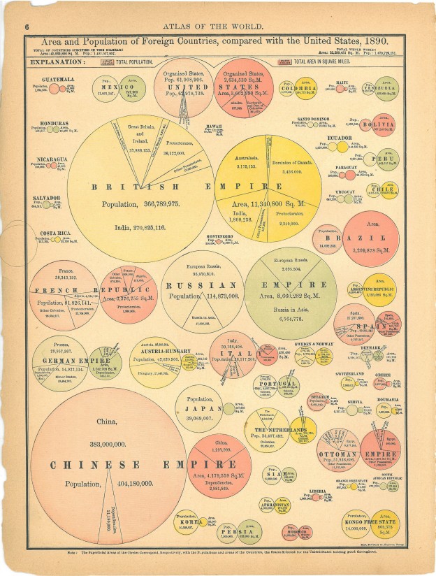
World Population Cartogram
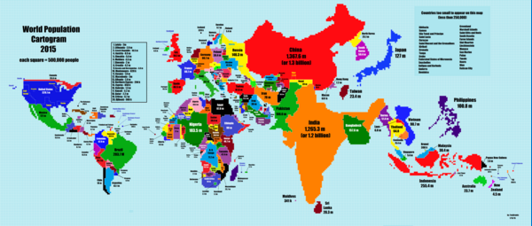
I love cartograms. Anything that reshapes how we view a map to add a different dimension for data is awesome! Here is one that shows where most of the world’s population really lives. Continue reading “World Population Cartogram”
Racial Make Up of Police Force vs Community
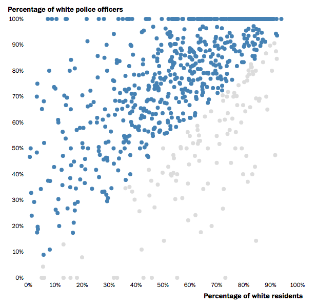
This post in the Washington Post is a great example of using an interactive scatter plot to show varying proportions. Interesting story too. Continue reading “Racial Make Up of Police Force vs Community”
A really bad pie chart
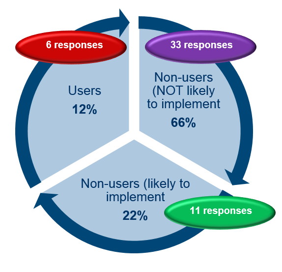
Pie charts are often maligned by the data viz community. Sometimes for good reason and sometimes to just to feel better by ridiculing those that don’t know you are not supposed to use pie charts. However there are those moments where something goes truly wrong. This has to be shared to prevent it happening again. Lets this act as a warning as to what can go wrong when you use PowerPoint without a licence. Continue reading “A really bad pie chart”
Visualising South Africa’s Imports and Exports
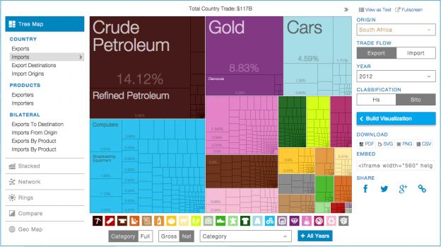
This is a great use of a tree map to show the breakdown of imports vs exports for South Africa. The last data point is 2012, but its still interesting to see. In 2012 we exported $20.4 billion and imported $10.3 billion worth of gold. Surely we could have just kept it half of it here and saved everyone a lot of time? Continue reading “Visualising South Africa’s Imports and Exports”
Visualising the London Underground
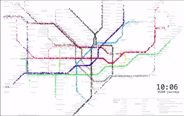
This is a great way to look at the total number of travellers on the London Underground on an average day. The audio that goes with it is very nice too! The one thing I would have liked to have seen would be the station entry/exit numbers to get a sense of the extent of an average journey. The data is here if you want to fiddle. Continue reading “Visualising the London Underground”
Data Visualisation Pioneers
There is quite a deep history of Visual SenseMaking and it seems a lot of the work in advancing and documenting data visualisation was done by engineers. Fine people engineers. This article gives an interesting review of some of the unsung pioneers of the discipline and small diversion about Isotypes. Continue reading “Data Visualisation Pioneers”
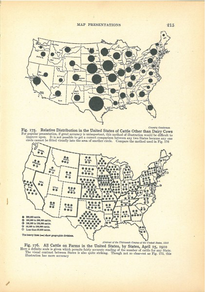
Really, REALLY Old Data Visualisations
I know it seems preposterous, but data visualistion predates the the computer. Its true! There were the pioneering people who used pen and paper and had enough free fingers to do the necessary calculations since they weren’t holding onto phones. No PowerBi or Tableau in sight. It was a better time. Things took longer but there was no Neflix, so people had more time to spare. Continue reading “Really, REALLY Old Data Visualisations”
Mapping Marriages
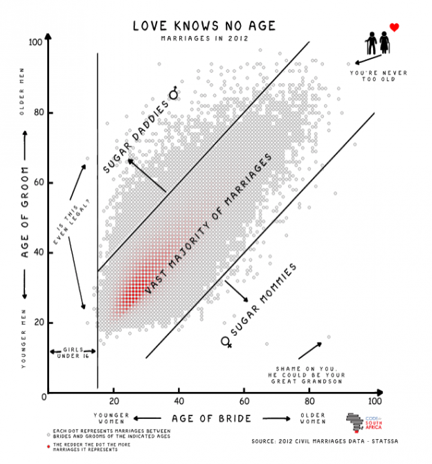
The very talented Adi Eyal created a scatter plot that shows the age distribution between men and woman when they get married. There is a big blob in the middle where the ages are similar and things get sparse towards the outlier sugar mommies and sugar daddies. Continue reading “Mapping Marriages”
7 Graphs for 7 (unlikely) Datasets
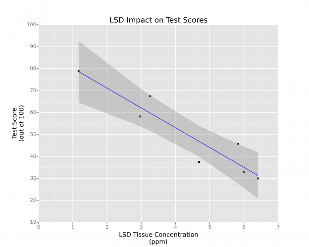
Sometimes when you are experimenting with a new data visualisation tool or some new library in R, you need a data set to use. R’s mtcars is not that interesting and frankly overused. Continue reading “7 Graphs for 7 (unlikely) Datasets”