As an amateur bassist, I have taken the road frequently traveled of being able to read tab and totally intending to learn to read musical staff notation at some point. Learning piano represents a bigger hurdle though, as you need to be able to read music notation to play something that has been written done. Continue reading “Piano Tab”
Microsoft’s Big Data Art Exhibition
Microsoft have an art exhibit at Sandton City at the moment, running until 3 July, to try make big data more interesting without actually using any data. Like many art exhibits, its head scratchy stuff (or beard-strokey, if you have one) and you really have to stretch quite hard to see the relevance. In the context of what they were doing, I am disappointed in the execution of the art itself. While the exhibit is about Big Data and the art pieces have explanations relating to Big Data, it does not mean that they works automatically convey anything meaningful about the topic. Remember, coloration does not equal causation. Continue reading “Microsoft’s Big Data Art Exhibition”
The Fallen of World War II
This is an amazing data visualisation / video showing the numbers of soldiers and civilians who died during World War II. Neil manages to compress a lot of information into the visuals and helps put the relative scales into perspective nicely. It is built around a narrative of how WWII compares with where we are today and comes to a gratifying final picture. Worth taking the time to watch. There is also an interactive version available here: http://www.fallen.io/
Relief Maps of the World’s Mountain Ranges
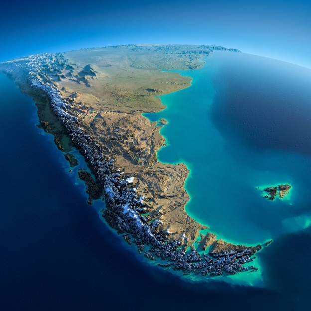
As the original article said: “Fascinating Relief Maps Show The World’s Mountain Ranges”.
Well, most of the the world. Except the part I live in… Africa. And India. China gets an honourable mention though. Continue reading “Relief Maps of the World’s Mountain Ranges”
Shazam’s huge São Tomé and Príncipe User Base
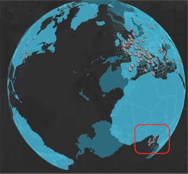
I had the pleasure of watching Cait O’Riordan speaking at last week’s Strata Hadoop in London. While she presented a fantastic talk, the one thing that struck me was a brief visualisation showing Shazam user activity around the world. Continue reading “Shazam’s huge São Tomé and Príncipe User Base”
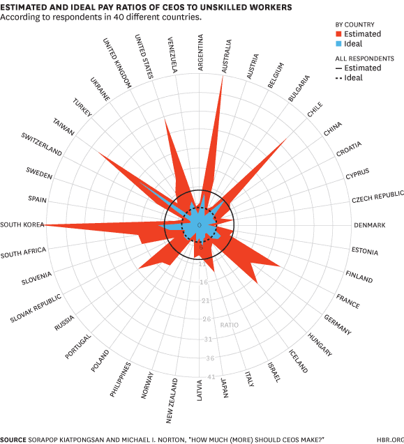
Skirt Width vs Beard Frequencies
I do like a good graph about beards, but when it makes a correlation with other fashion items, its even better. This lovely piece in The Atlantic covers beard length and general facial hair coverage as far back as accurate recordings go. As interesting as it is, this graph made it worth reposting: Skirt Width vs Beard Frequencies. Continue reading “Skirt Width vs Beard Frequencies”
Pie Chart Nazis
One of the things that data visualisation people like to do is point out how bad pie charts are. Its the first thing you do to show off your data viz chops. The example below from Apple being the prime candidate of a misleading pie chart. Continue reading “Pie Chart Nazis”
The Reddit Universe
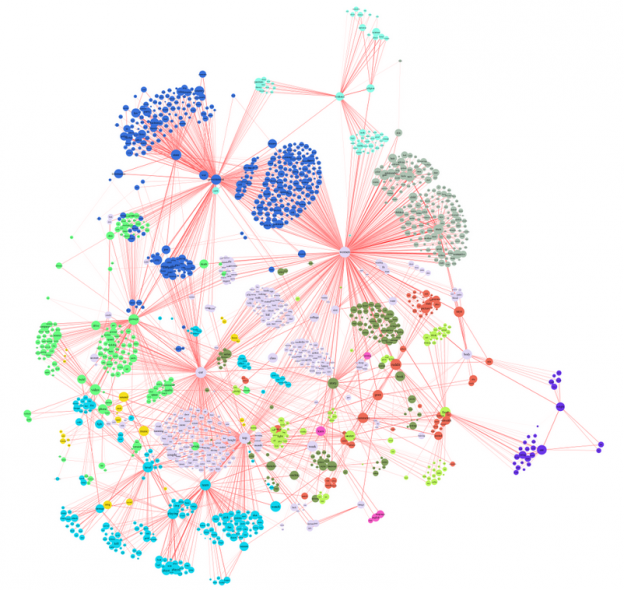
This picture of what interests reddit has been doing the rounds recently. Its a fairly large network graph showing the links between the different areas of interest of reddit users. The detail of the article is interesting on its own, but what this highlights for me is the difficulty with using large network graphs to convey information graphically. Since you have to keep zooming and moving around, you keep adding new location and context information to working memory fairly frequently, and something will fall out. Like when Homer Simpson’s took a wine making course. Continue reading “The Reddit Universe”
Naked Data Newsletter
If you aren’t yet a subscriber, you should be: http://code4sa.org/newsletter/
It is one of the most interesting sources of South African specific data, and data science and visualisation in general.
MammothBI video
I’m rapidly running out of my allotted video time on YouTube that does not include a cat.
The recording is from the MammothBI conference from last year. It was a great event, modelled on the TEDx style and very professionally handled. Well done to Jason Haddock and the team for doing such a great job. Looking forward to going again this year.