Cool new dashboard design

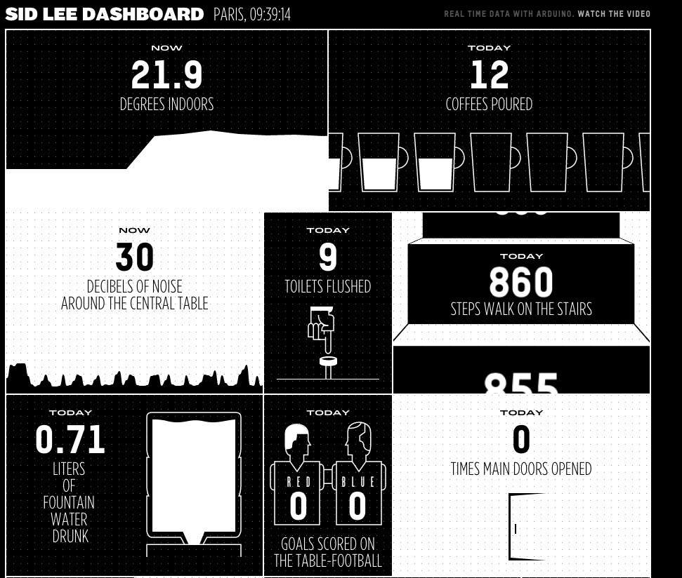
A colleague of mine sent me a link to a new web based dashboard designed by Sid Lee. In the book Information Dashboard Design by Stephen Few, there are many examples of how not to do it, and generally the idea of yet another dashboard does not fill me with any sense of excitement. This was one of those moments where I expected to click and run but this one really caught my eye.
While the effectiveness of the actually data communication techniques might not be as good as it could be, it is an order of magnitude more interesting to look at than the usual Excel pie chart brigade.
Screen Shot 2015-03-05 at 10.39.06 AM

South Africa’s Expensive Fuel Costs

This infographic from Statista pastes a grim picture of fuel costs in South Africa. It shows that over 5% of the average South African’s salary/wages goes to fuel costs. I’m not convinced about the validity of this presentation though. The source data may be correct, but it paints a picture of expensive fuel. South Africa does not have the most expensive fuel in world, in fact its about average. This simply raises more questions. How much fuel do we buy? Do we buy a lot more than other countries? Who is buying the fuel? Does this include what you pay for riding in a taxi or on a bus? Can you separate those who own cars and therefore pay for fuel out from the list?

Cern OpenData

event

Fancy yourself as an arm chair Sheldon Cooper, or are you more of a Boson the clown? Cern have made some of the data from the LHC available via their open data project. Various data sets and visualisation engines are available along with educational material to help make a bit more sense of it. This is all available from their OpenData site.

But in the words or Homer Simpson: “There’s so much I don’t know about astrophysics. I wish I’d read that book by that wheelchair guy.”

Satellite Imagery Font

While I am not a typographer per se, I do like a good font. I also really like cool technology to do image analysis, so when a project comes along the merges both, I have to gush a bit.

This recently funded kickstarter project aims to take satellite imagery and find shapes that look like letters and create a font set from it:

https://www.kickstarter.com/projects/357538735/aerial-bold-kickstart-the-planetary-search-for-let

Aerial Bold is the first map and typeface of the earth. The project is literally about “reading” the earth for letterforms, or alphabet shapes, “written” into the topology of buildings, roads, rivers, trees, and lakes. To do this, we will traverse the entire planet’s worth of satellite imagery and develop the tools and methods necessary to map these features hiding in plain sight.