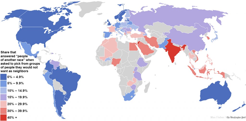
The Daily Mail link baited an article originally published in the Washington Post about the world most racists countries and they produced this map:
The data for this comes from the World Values Survey, and is clear indicator of what should be an internet law (something like Godwin’s Law or Poe’s Law) that states:
“Just because the data is attached to a pretty infographic (or map or graph), does not make it true”
Needless to say this caused a big brouhaha and the Washington Post did an update saying that the results could be interpreted differently. Plus of course the originally published data had some massive errors. But it was too late, the map is out and people have made up their minds and moved on.
I know I’m late in posting this and in Internet terms its not just old news, its not news, but it is nice to show off something that puts South Africa in a positive light. Well, something that shows that survey respondents from South Africa decided to say the right thing.


