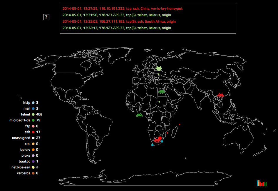
 Attack maps are becoming a more common data visualisation with some great examples that have been doing the rounds here, here and here. I tackled a similar project that has been put on hold for now, but I really enjoyed making the map and I think its a fun interpretation. The version I put up shows the attack data for 1 May 2014.


