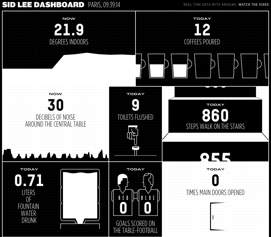
A colleague of mine sent me a link to a new web based dashboard designed by Sid Lee. In the book Information Dashboard Design by Stephen Few, there are many examples of how not to do it, and generally the idea of yet another dashboard does not fill me with any sense of excitement. This was one of those moments where I expected to click and run but this one really caught my eye.
While the effectiveness of the actually data communication techniques might not be as good as it could be, it is an order of magnitude more interesting to look at than the usual Excel pie chart brigade.


