
Microsoft have an art exhibit at Sandton City at the moment, running until 3 July, to try make big data more interesting without actually using any data. Like many art exhibits, its head scratchy stuff (or beard-strokey, if you have one) and you really have to stretch quite hard to see the relevance. In the context of what they were doing, I am disappointed in the execution of the art itself. While the exhibit is about Big Data and the art pieces have explanations relating to Big Data, it does not mean that they works automatically convey anything meaningful about the topic. Remember, coloration does not equal causation. Continue reading “Microsoft’s Big Data Art Exhibition”
Month: June 2015
The Fallen of World War II
This is an amazing data visualisation / video showing the numbers of soldiers and civilians who died during World War II. Neil manages to compress a lot of information into the visuals and helps put the relative scales into perspective nicely. It is built around a narrative of how WWII compares with where we are today and comes to a gratifying final picture. Worth taking the time to watch. There is also an interactive version available here: http://www.fallen.io/
Relief Maps of the World’s Mountain Ranges
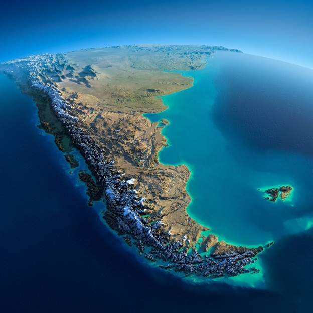
As the original article said: “Fascinating Relief Maps Show The World’s Mountain Ranges”.
Well, most of the the world. Except the part I live in… Africa. And India. China gets an honourable mention though. Continue reading “Relief Maps of the World’s Mountain Ranges”