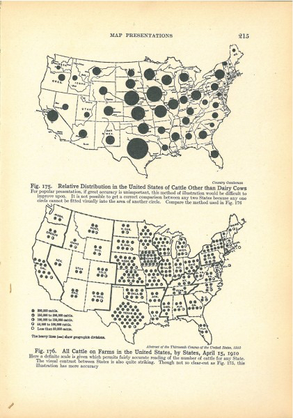
There is quite a deep history of Visual SenseMaking and it seems a lot of the work in advancing and documenting data visualisation was done by engineers. Fine people engineers. This article gives an interesting review of some of the unsung pioneers of the discipline and small diversion about Isotypes. Continue reading “Data Visualisation Pioneers”
Month: August 2015
Really, REALLY Old Data Visualisations
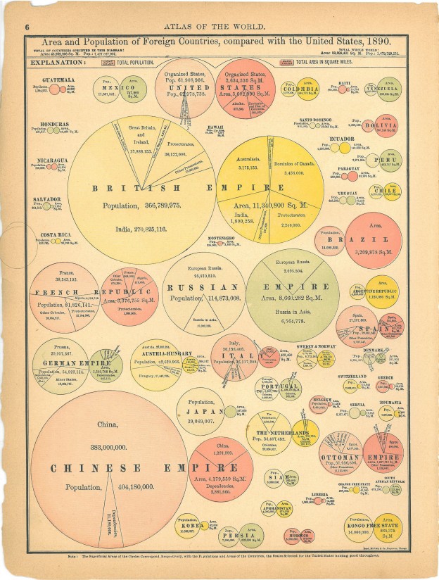
I know it seems preposterous, but data visualistion predates the the computer. Its true! There were the pioneering people who used pen and paper and had enough free fingers to do the necessary calculations since they weren’t holding onto phones. No PowerBi or Tableau in sight. It was a better time. Things took longer but there was no Neflix, so people had more time to spare. Continue reading “Really, REALLY Old Data Visualisations”
Mapping Marriages
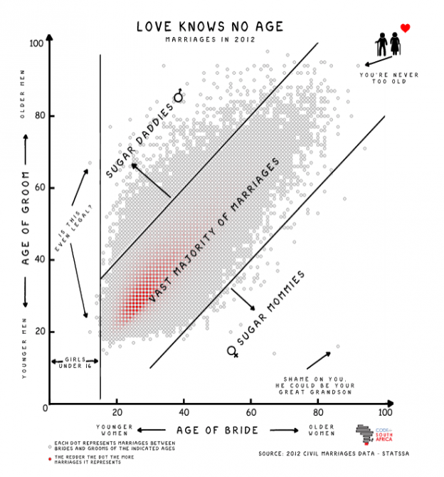
The very talented Adi Eyal created a scatter plot that shows the age distribution between men and woman when they get married. There is a big blob in the middle where the ages are similar and things get sparse towards the outlier sugar mommies and sugar daddies. Continue reading “Mapping Marriages”
7 Graphs for 7 (unlikely) Datasets
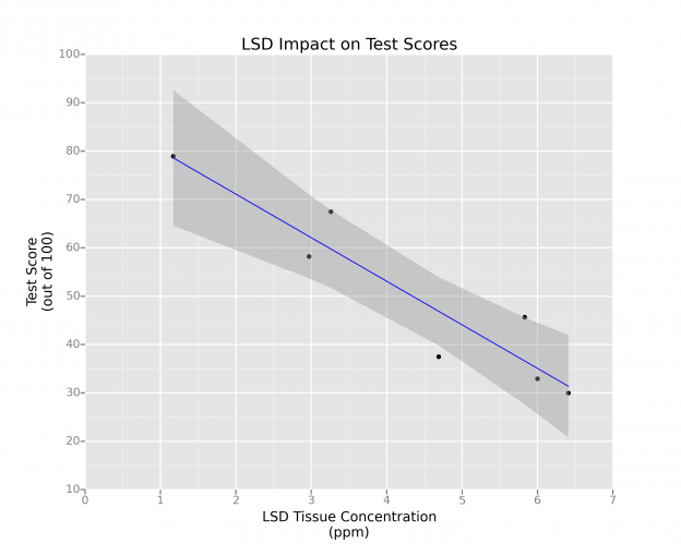
Sometimes when you are experimenting with a new data visualisation tool or some new library in R, you need a data set to use. R’s mtcars is not that interesting and frankly overused. Continue reading “7 Graphs for 7 (unlikely) Datasets”


