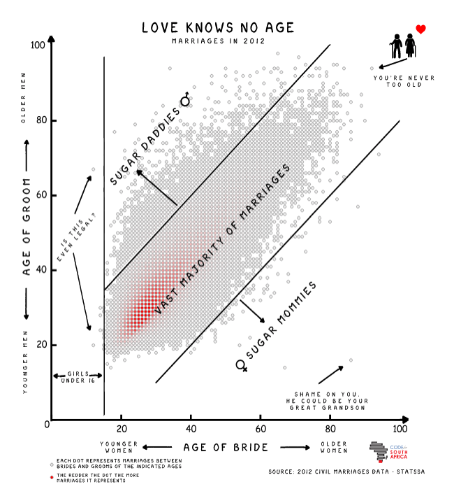
The very talented Adi Eyal created a scatter plot that shows the age distribution between men and woman when they get married. There is a big blob in the middle where the ages are similar and things get sparse towards the outlier sugar mommies and sugar daddies. This is a great example of an interactive visualisation.


