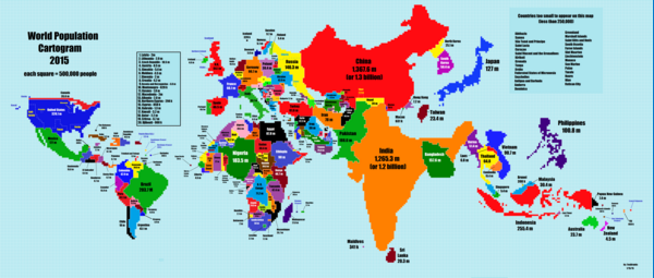
I love cartograms. Anything that reshapes how we view a map to add a different dimension for data is awesome! Here is one that shows where most of the world’s population really lives. Continue reading “World Population Cartogram”
Month: September 2015
Racial Make Up of Police Force vs Community
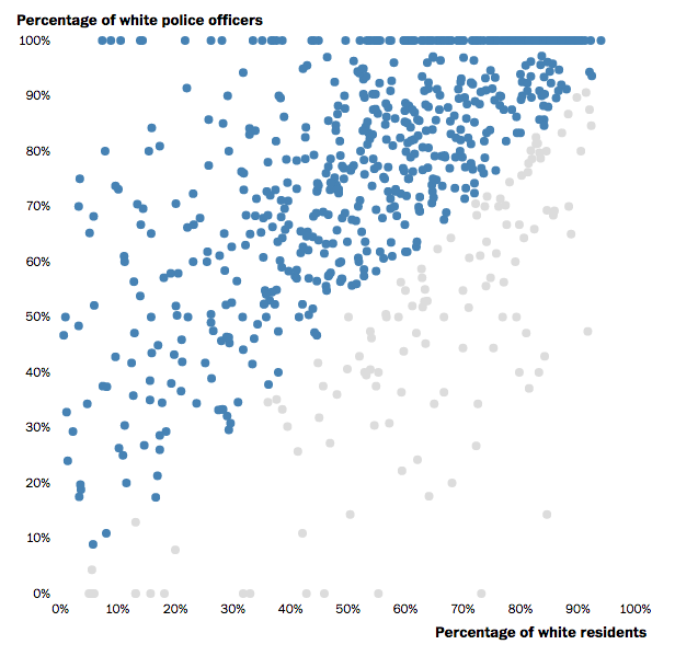
This post in the Washington Post is a great example of using an interactive scatter plot to show varying proportions. Interesting story too. Continue reading “Racial Make Up of Police Force vs Community”
A really bad pie chart
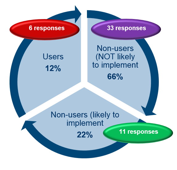
Pie charts are often maligned by the data viz community. Sometimes for good reason and sometimes to just to feel better by ridiculing those that don’t know you are not supposed to use pie charts. However there are those moments where something goes truly wrong. This has to be shared to prevent it happening again. Lets this act as a warning as to what can go wrong when you use PowerPoint without a licence. Continue reading “A really bad pie chart”
Visualising South Africa’s Imports and Exports
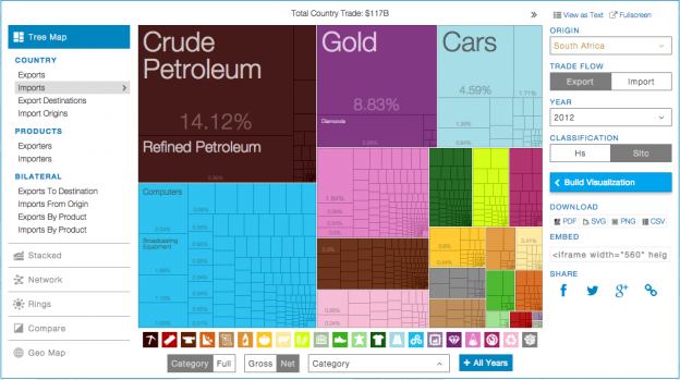
This is a great use of a tree map to show the breakdown of imports vs exports for South Africa. The last data point is 2012, but its still interesting to see. In 2012 we exported $20.4 billion and imported $10.3 billion worth of gold. Surely we could have just kept it half of it here and saved everyone a lot of time? Continue reading “Visualising South Africa’s Imports and Exports”
Visualising the London Underground

This is a great way to look at the total number of travellers on the London Underground on an average day. The audio that goes with it is very nice too! The one thing I would have liked to have seen would be the station entry/exit numbers to get a sense of the extent of an average journey. The data is here if you want to fiddle. Continue reading “Visualising the London Underground”