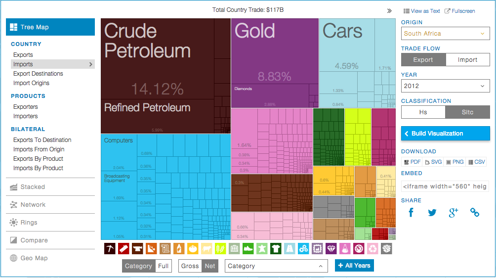
This is a great use of a tree map to show the breakdown of imports vs exports for South Africa. The last data point is 2012, but its still interesting to see. In 2012 we exported $20.4 billion and imported $10.3 billion worth of gold. Surely we could have just kept it half of it here and saved everyone a lot of time?


