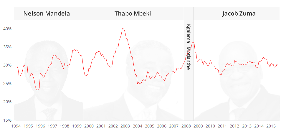
There have been a couple of articles recently that have spoken about South Africa having a bad Misery Index rating. Its quite a harsh term, but ennui index or “not cool man” index isn’t going to grab headlines. Like a lot of statistics reported in popular media, it tends to be reported as a snap snot number at a particular time rather than the trend. So here is a historic plot that shows how miserable we have been since 1994.
Note that I have NOT started the y-axis at zero so you can get a better sense of the fluctuations. I don’t put too much value into this particular metric, but its interesting in a time when all eyes are on the president that we are seemingly less “miserable” than when he took over.
I got the data from here:
http://www.statssa.gov.za/?page_id=1854&PPN=P0211&SCH=6255
http://liberta.co.za/blog/cpi-inflation-rate-in-south-africa-current-and-historical/
http://businesstech.co.za/news/international/77737/south-africa-unemployment-1994-2015/


