Category: General
Physical Infographics
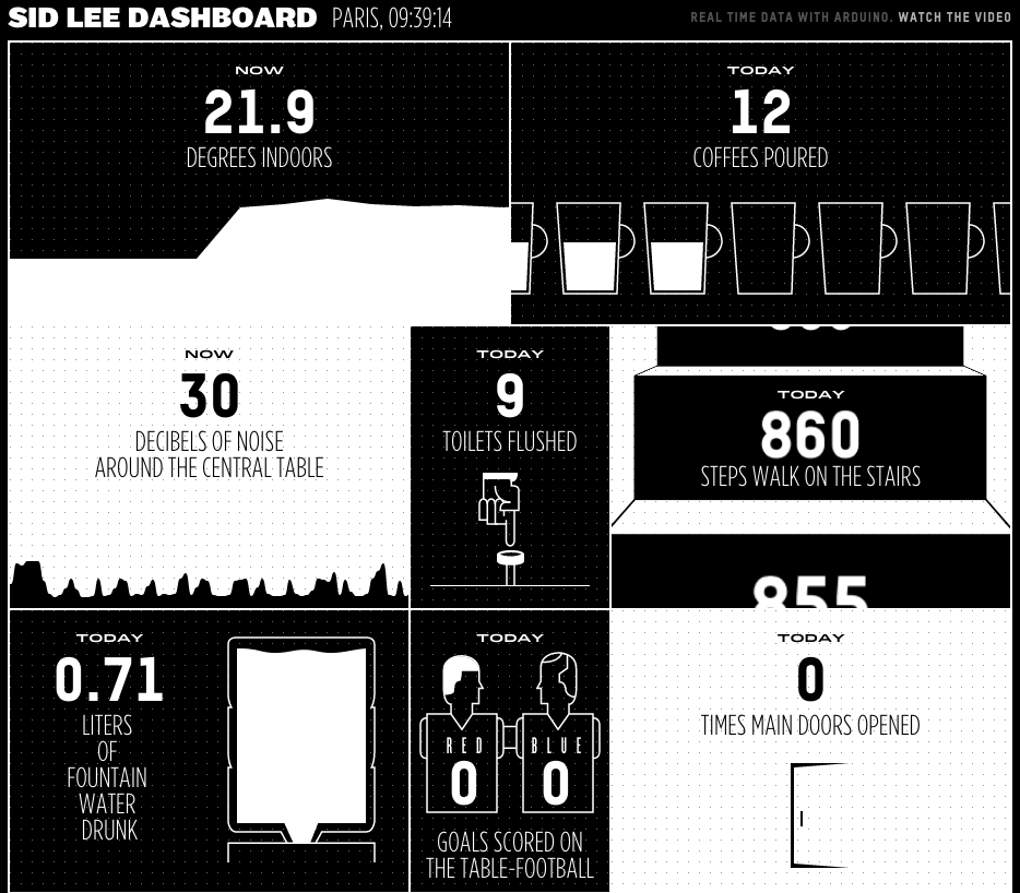
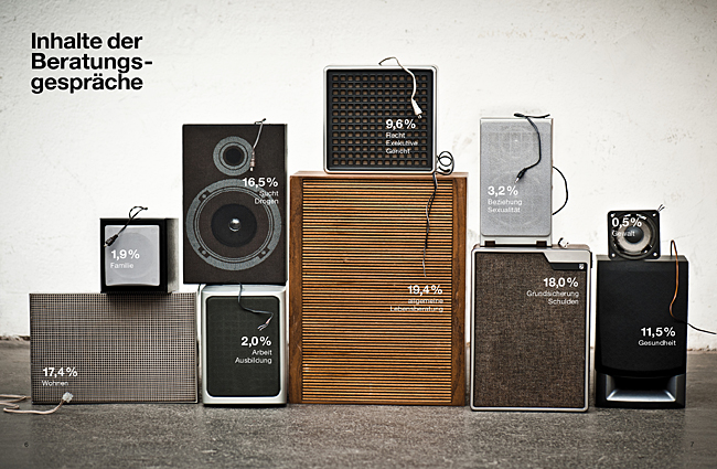
These IRL, physical infographics are awesome. I think we all need to spend less time with D3 libraries and more time arranging our furniture into graphs.
Cern OpenData
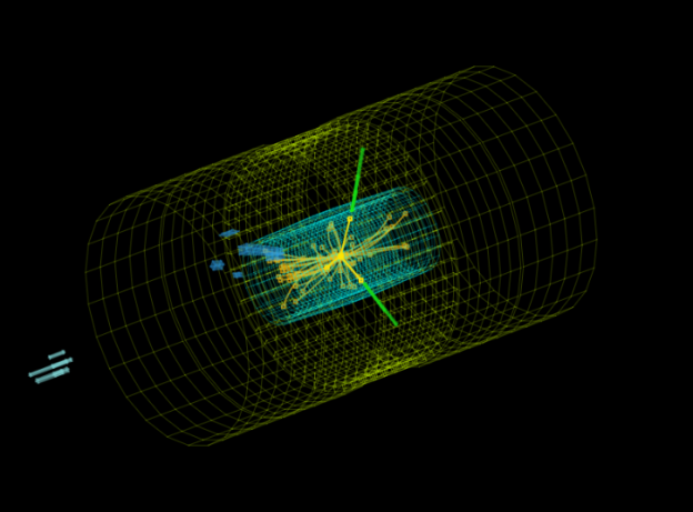
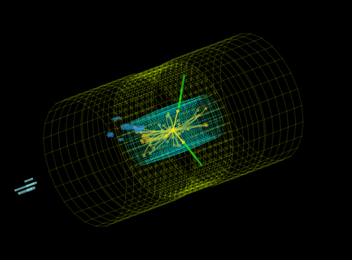
Fancy yourself as an arm chair Sheldon Cooper, or are you more of a Boson the clown? Cern have made some of the data from the LHC available via their open data project. Various data sets and visualisation engines are available along with educational material to help make a bit more sense of it. This is all available from their OpenData site.
But in the words or Homer Simpson: “There’s so much I don’t know about astrophysics. I wish I’d read that book by that wheelchair guy.”
Satellite Imagery Font

While I am not a typographer per se, I do like a good font. I also really like cool technology to do image analysis, so when a project comes along the merges both, I have to gush a bit.
This recently funded kickstarter project aims to take satellite imagery and find shapes that look like letters and create a font set from it:
https://www.kickstarter.com/projects/357538735/aerial-bold-kickstart-the-planetary-search-for-let
Aerial Bold is the first map and typeface of the earth. The project is literally about “reading” the earth for letterforms, or alphabet shapes, “written” into the topology of buildings, roads, rivers, trees, and lakes. To do this, we will traverse the entire planet’s worth of satellite imagery and develop the tools and methods necessary to map these features hiding in plain sight.
Visualising Different Musical Genres
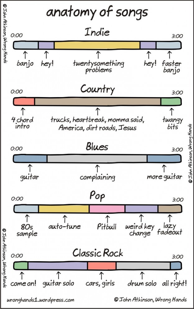
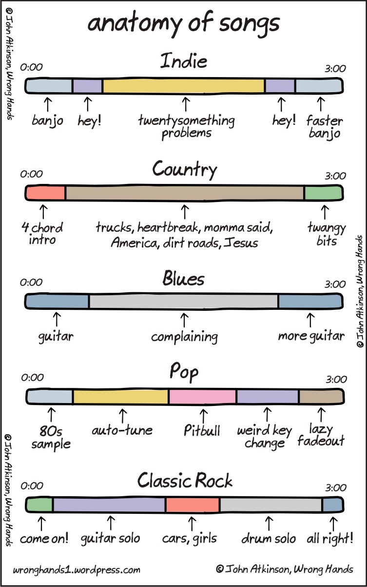
I found this fun visualisation of the anatomy songs from different musical genres. Its obviously not serious (or based on any actual data) but I like the implementation 🙂
Flawless Future Predictions
The stock market prediction scam is an old scam, and its nice to see that it has been updated to use social media a bit better.
Head of Geography
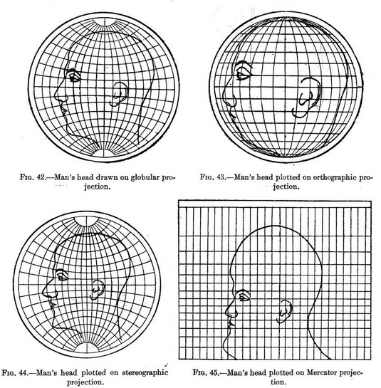
An image has been doing the rounds that shows the distortions introduced when reducing a 3D earth to a 2D representation. Like all those huge maps we used to have on our walls with pins in them to show where you’ve travelled. The drawings used in the original work show the distortions as applied to a human head, something we are familiar with.
Air Traffic Worldwide
Plotting the flight paths of airplane traffic seems to be a new branch of data visualisation on its own. The most recent video doing the rounds is this one:

