Monitoring System Dashboard

three6five probe dashboard

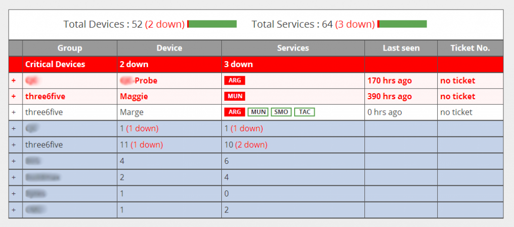
Another three6five related project was the requirement to create a dashboard for our support team to have an overview of all the probes that we have deployed on site at our customers. Specifically it needed to firstly highlight any probes that are not functioning, and then any services on an active probe that are not functioning.

This will live on a big TV screen in our support centre and can be seen from anywhere in the office. While we send out notifications, its good to have a easy to view list of all the issues that are being dealt with. Continue reading “Monitoring System Dashboard”

Path Elevation Calculator

elevation

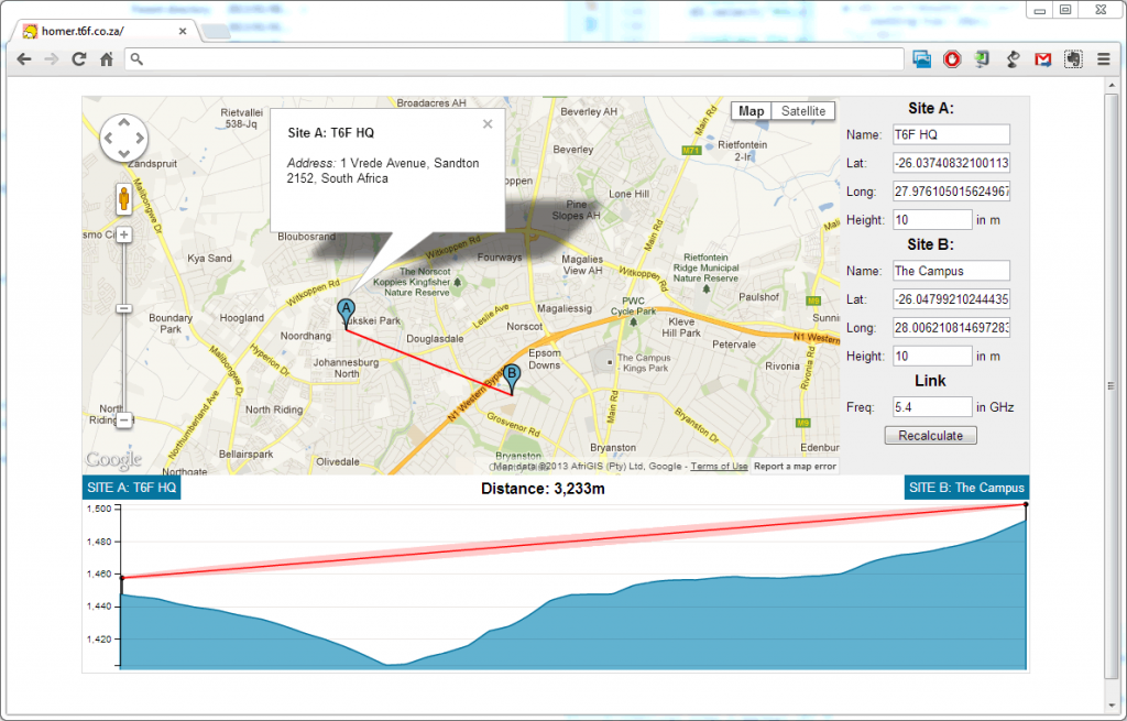
A colleague of mine at three6five recently asked if it would be possible to get elevation data for a path between 2 points using the Gooogle Elevation Service. Since we’re mostly Mac users, it is difficult to get useful path profile software to run that doesn’t require that you run Windows. After a quick look at the format the data is returned by the Google Maps API, I realised that it should be fairly straight forward to produce a graph of it in D3. That graph would effectively be a contour of the land for a line between 2 specific points.

Add a mast and Freznal Zone and you have working wireless path propagation plotter.

Honey Pot Project

HoneyPot


http://viz.t6f.co.za/

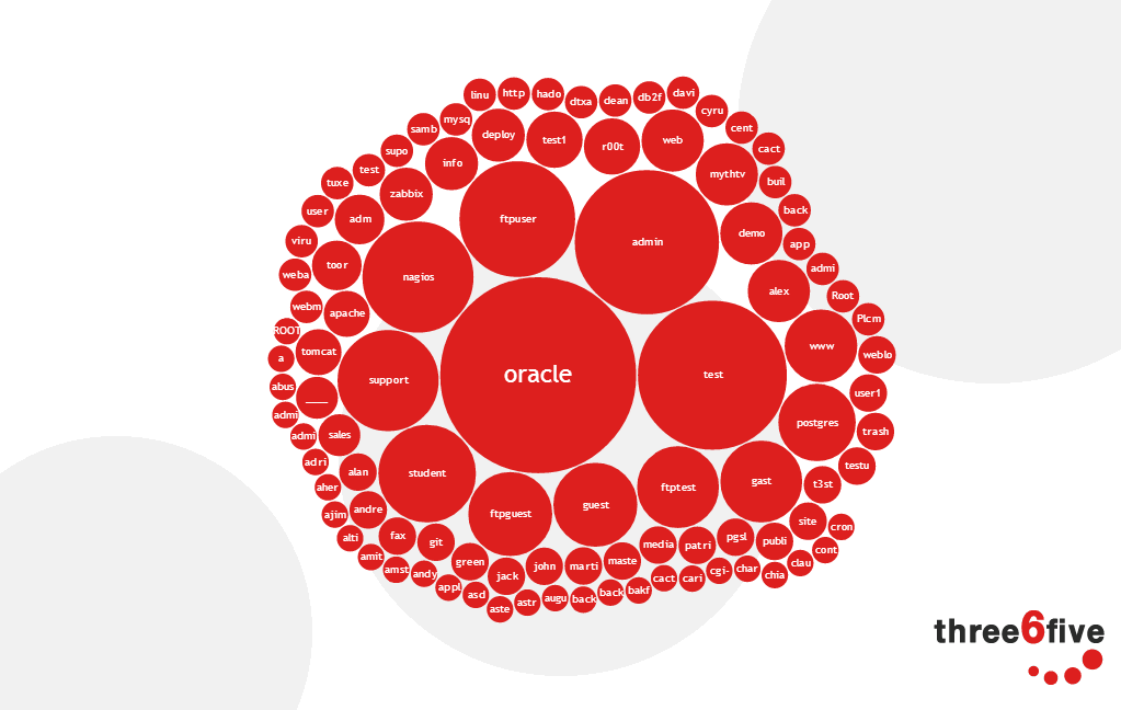
At three6five, we undertook a project to put run honey pot server on a local internet connection to see what the threat levels are. This a self guided presentation to take you through the results. This was my first real exploration of the D3 library. The actual presentation framework also uses D3 and something called Stack by Mike Bostock, one very clever dude!

South African Census Data Explorer

censusx600

http://www.limn.co.za/dev/census

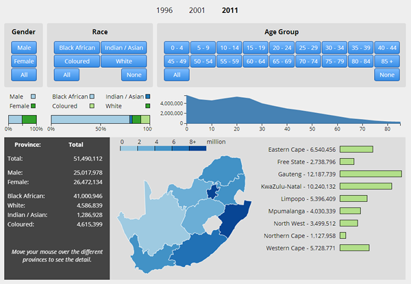
With the publication of the final data for the South African 2011 Census, I built an interactive application using D3 and the published census data to try make the presentation of the information more useful. The issue with the census data is that it has either been summarised and presented in a PDF document with a particular view in mind, or you have to go digging into the data yourself to find what you are looking for. Assuming of course that you know what you are looking for before hand.

I was looking for a way to present a fair amount of information on a single screen while allowing interactivity and exploration. This allows you to play and discover new aspects of the data that you may not have previously thought about.

The first interesting anomaly I found was a decline in the number of children born in 2001. I have no idea why that is, if its a data problem or clear indication of alien abductions, but this presentation format allowed me to more easily think of questions to ask about the South African population.

census data point

The census data was pulled from the Statistics South Africa website and converted to JSON format using python. There was some inconsistency in the presentation format of the data between the different years, so some data had to be discarded. This was never more tha 1% of the total available data though.

The rest of the application is written entirely in Javascript using D3.