As any person who reads the news in South Africa, I’m prone to the problem of having a two week memory of news that made headlines. But our brains fool us into thinking that we remember more of the past and are better able to predict the future. At the time of writing this (17 Feb 2013), the following news items about Jacob Zuma were published:
http://www.iol.co.za/news/politics/nothing-inspiring-in-zuma-s-speech-glaser-1.1470658#.USDan6USZ8E
As with all quick news reports, it tends to focus on a particular issue that will be newsworthy and helps confirm people’s biases, whichever way they may lean. You seldom get a clear picture of the track record of a president, only a snapshot of current sentiment. It seems to me, the job of a president that wants to stay is power is to first manage public opinion, and then to be in charge of running the country. How do you tell if they are doing a good job on the second part? At this point, I read a lot of negative sentiment around Jacob Zuma. The usual “the country is falling apart” rhetoric mixed with cultural biases around his behaviour that is contrary to what is deemed acceptable.. Also there are our biases towards viewing short term change in economic indicators as representative of a longer term trend. When the Rand weakens against the dollar or inflation goes up, without looking at a much longer timeline, these data point blips shouldn’t matter. Any short term negative change is usually highlighted in the news and tends to cloud the view of actual job performance.
Surely the job of the president is to make the best possible life for the people in the country? It may be a personal bias, but this is a view that I have. I view this in the same way that the management and CEO of a company will view the results of the “Best Company to Work For” survey’s. Similarly, making South Africa the best country to live in for everyone is the responsibility of our government and ultimately our president. If being the “best country to live in” is achieved we should be happy with the job he is doing. (I say “his” and “he” while fully aware that women are as capable of leading our country, but my sample set seems to have a gender bias as we have yet to vote in a female president).
It was with this idea in mind that I set about to build a data visualisation to answer a question I have:
Since 1994, which president has managed the country such that life is better for the most South Africans?
If I look at the press currently, there is strong sense the Jacob Zuma is not doing a good job. However, this is not a representation of the past 5 years of his leadership. You have to therefore look at the available recorded data to determine the answer. Unfortunately, there is no clear best president for the country index that will answer the question definitively. The only option is to look at the information that is available that can be used to infer an answer. With the advice of my friend Stephen van Jaarsveldt, who lectures in economics, I chose unemployment, inflation and GDP growth. The data for all three is available, albeit tricky to find, and this data can be correlated with a perceived better life for all South Africans. While more comprehensive measurements exist to give an indication of a better life, such as the Human Development Index, the available South Africa data is incomplete and does not present trends that overlap with presidential terms. If you believe that you have a better measure or that the data is not correct, please contact me or post a comment and I will update accordingly.
Unemployment
What is inferred about employment is that it is someone who is willing to work but is unable to get a job and will be under financial pressure, and life will be getting worse over time. Therefore, the more people who have jobs, the better it is for the country overall. I think that part of the president’s job is to ensure that the various policies implemented decrease the overall unemployment rate.
The measurement of unemployment in South Africa was hard to find and getting consistent data proved even more difficult. The best data source I found was this paper discussing the rise of unemployment. I also took disparate data from the revised Labour Force Surveys, the October Household Surveys and other employment related documentation that was found in the furthest reaches on the Statistics South Africa website. I used the most recent data and tried to have more than one source with the same value. Statistics South Africa had provided some recent revisions of the unemployment data, and this was used where available.
There is some dispute as to the validity of the unemployment data as it is collected via a survey and the definition of unemployed is not simply “a person without a job”.
Inflation
From an individual’s perspective, inflation is a measure of the rate of change of the price of goods and services. High inflation means that prices are continually going up, and unless your salary is changing proportionately (assuming you have a job), the end of the month SaltiCrax comes closer and closer to payday Low inflation means your financial situation is more manageable and good monetary policy by the ministers appointed by the president should be keeping inflation low. This is the theory anyway.. Inflation data is well recorded and easily available as the Consumer Price Index for the country from various sources. I used the Reserve Bank’s data for this..
GDP
The last measure I used is Gross Domestic Product or GDP. I specifically used GDP “growth”, to show if the country is becoming more or less prosperous over time. While GDP is not an absolute measure of individual income, it is a good indicator of individual prosperity. Wikipedia sums it up well.
GDP per capita is not a measurement of the standard of living in an economy; however, it is often used as such an indicator, on the rationale that all citizens would benefit from their country’s increased economic production. Similarly, GDP per capita is not a measure of personal income. GDP may increase while real incomes for the majority decline. The major advantage of GDP per capita as an indicator of standard of living is that it is measured frequently, widely, and consistently.
Once I had the data and started to plot the graph I began thinking about the speeches that our president makes and decided to see if there were correlations between the message in the speech and the economic data. The only conceivable way to do this was to count the word use in the speeches and produce a kind of time-related word usage graph. Nothing really seemed to stand out so I opted for a time based wordle implementation instead. As many of the data visualisation experts will tell you, wordles are not a good way to show real data, but it certainly looks nice.
Below is the final graph, with all the data present showing how each of our presidents since 1994 have fared in making it a better South Africa for us to live in:
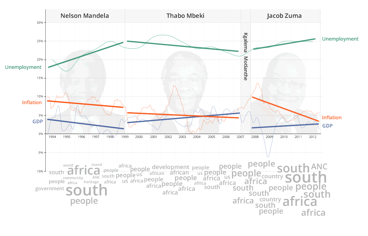
Trend lines are shown as the thicker straight lines running over the underlying graphs to give an indication of the trends for each president. The tag cloud at the bottom shows the most commonly used words in speeches by the respective president in a particular period. The bigger the word, the more frequently it was used in more speeches.
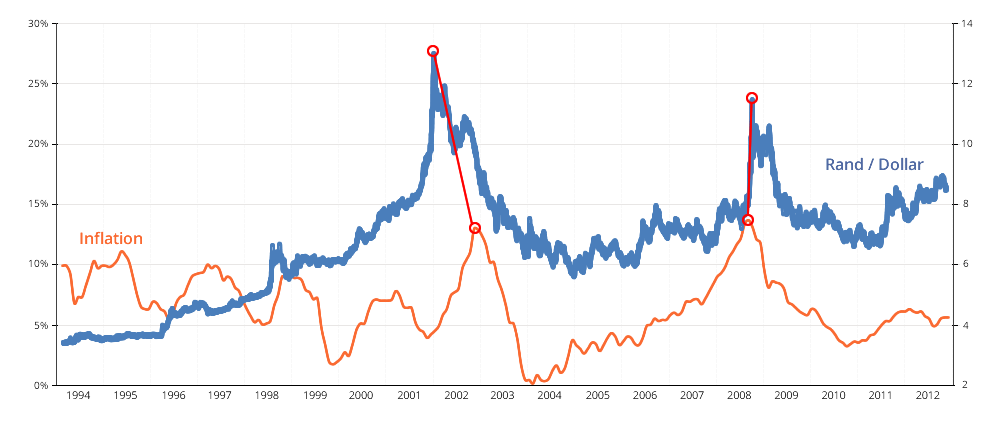
Notable Data Points
The 2 peaks in inflation occur around the time of the market downturns of 2002 and 2008. It also follows fairly closely with the highest points of the Rand / US Dollar exchange rate.
Conclusion
One of the main benefits of graphing data is that it presents the clearest way to see trends and understand how one parameter changes compared with another. Without looking at the data in context, a single datum point provides very little information about a trend. However, the way much of the news is presented is as a single datum point or a short trend. The shorter the data range, the less accurately you can infer what is actually going on. Now that it’s possible to look at the data over the terms of each president we can measure each president’s overall performance in context.
| President | Unemployment | Inflation | GDP |
| Nelson Mandela | +7% | -2% | -3% |
| Thabo Mbeki | -3% | -2% | +4% |
| Jacob Zuma | +4% | -7% | +1% |
To go back and answer my original question:
Since 1994, which president has managed the country such that life is better for the most South Africans?
Thabo Mbeki was the best president, and Nelson Mandela the worst. This is a difficult conclusion to reach as we all love Nelson Mandela and he is our icon that represents our democracy. We have to also take into consideration a number of complicating factors such as how foreign markets and economies influence have influenced the numbers. Also for Nelson Mandela, how much influence did the previous government have on trends coming into his term in office. It does show though that Jacob Zuma may just be getting less credit than he deserves in the media.
Missing Speeches
When collecting the words from the speeches, I found the ANC’s website had thought it prudent to remove most of Thabo Mbeki’s speeches. They are still available via the Department of International Relations and Cooperation’s site however. I’ll leave what you make of that up to you 🙂
Kgalema Motlanthe
Kgalema Motlanthe held the office of President for only 7 months, and would have been on the tailend of implementing Thabo Mbeki’s various economic plans. While there is data for the period that he was president, it would not be fair to judge him with the rest as there is not enough of a time period to see any equivalent trends.
Data Sources:
Unemployment:
- http://www.nber.org/papers/w13167
- http://www.statssa.gov.za/publications/EmployUnemploy/EmployUnemploy1997.pdf
- http://www.statssa.gov.za/publications/P0210/P0210September2000,2001,2002,2003,2004,2005,2006,2007.pdf
- http://www.statssa.gov.za/publications/P0211/P02111stQuarter2011.pdf
GDP and Inflation:
Speeches:


