 I do occasional Park Runs and trail runs. On a recent run I started to wonder what the distribution or histogram of runners looks like. It would be a big moving blob at the start that slowly thins out as the faster runners pull away from the slower runners. The shape will depend on the race distance and the number of runners. I first did it for the Comrades Marathon in 2014, and now again for the JP Morgan Corporate Challenge. The shape will depend on the race distance and the number of runners.
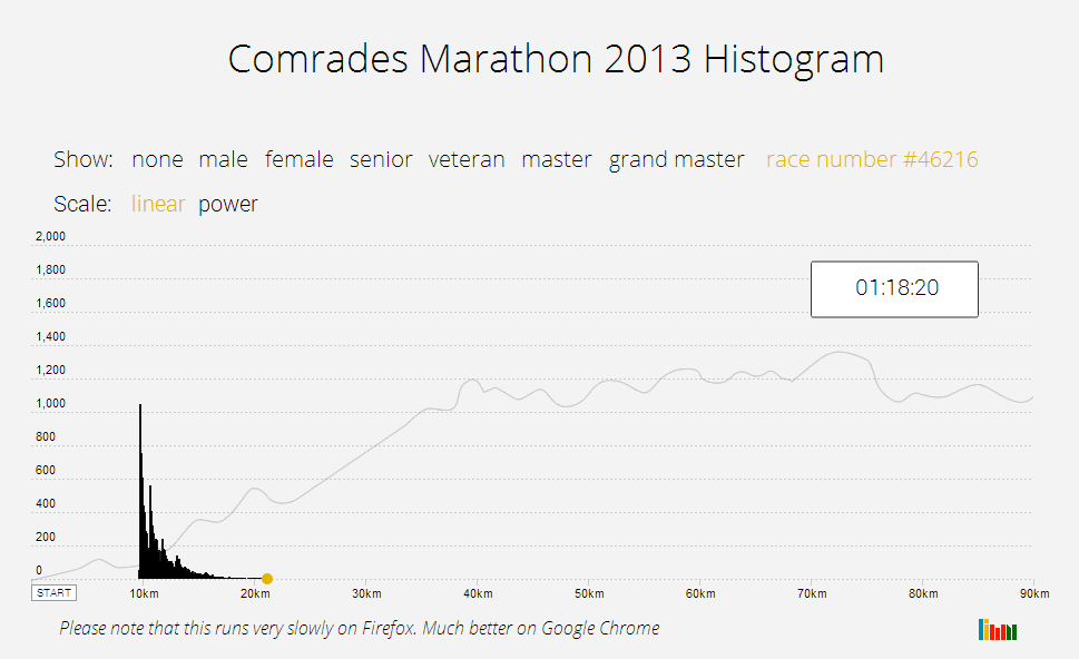
The main measurement we have per runner is their finish time, which can be translated into pace. Pace can be converted to distance travelled after a certain time. Therefore calculating a histogram of the distance run for each runner at a certain time will provide a visual blob of what is going on.
By creating a series of sequential histograms and transitioning between them its possible to create an animation of the race showing how the blob moves over time. The Comrades website provides the results for each runner, including their finish time, gender and age category.
Click on the image below to see how it looks:

The height (or y axis) of any line on the moving blob shows the approximate number of runners who had covered that distance at that point in time. Onto this you can show an overlay to display the data just for male or female runners, or any of the categories: senior, veteran, master or grand master. If you ran the race in 2013 and finished, you can track yourself against the blob by entering your race number. You can also switch scale types between a linear of power scale to get a logarithmic expansion of the y axis. It helps with the visual details.
The first and most important note is that this an approximation of the race based on each runner’s finishing time and a lot of summary calculations. A runner’s pace will change over the course of the race and the leaders will swap places. Using each runners exact pace at each point in the race would change the moving blob, but not significantly as this is based on averages for a large number of runners. However using the exact pace of each runner throughout the race would require significantly more calculations and could not be rendered in real time in your browser.
Speaking of which, Firefox doesn’t transition SVGs well and it renders this particular visualisation very slowly. Please use Google Chrome to view it at the speed it should be.
Since this is the first of these visualizations, I have nothing to compare it to (hint: suggest another marathon that has handily available data for me to do this with). The one interesting anomaly was a saw tooth like distribution of the back of the blob.
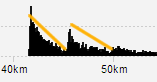
These are runners trying to finish in under 11 hours or under 12 hours. If you expand the y axis using the power scale, you will see the same if true for 10 hours.


Awesome work! would love to get more realtime data to see the how the busses form (I’m sure there is a lot more variation than the average pace suggests). Thanks for sharing 🙂