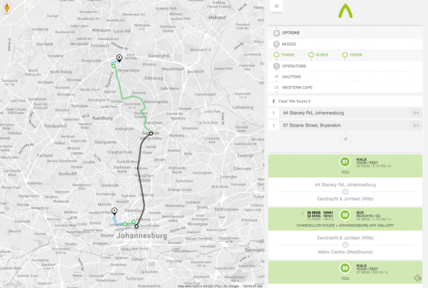
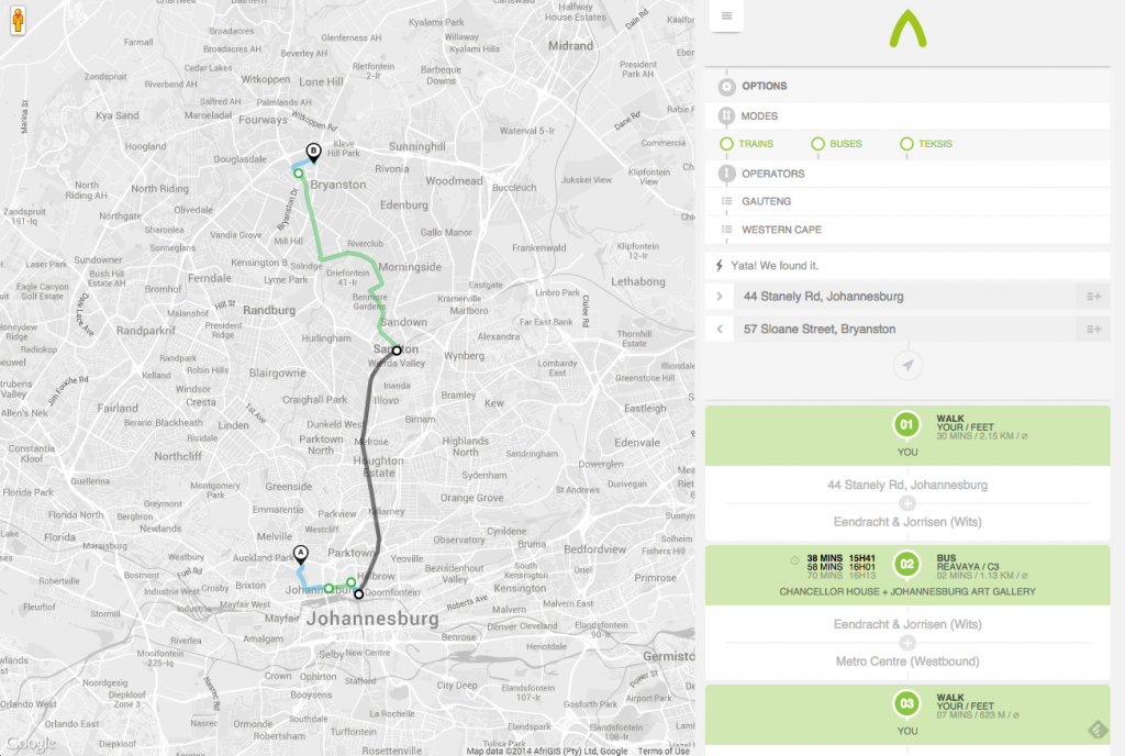
A way to be is a great start at mapping the transport systems in South Africa that remain unmapped and off the web. Adding Taxis onto Google Maps is a fantastic achievement and we can but hope more transport providers add their data to it.
Month: September 2014
Yet Another IP Attack Map
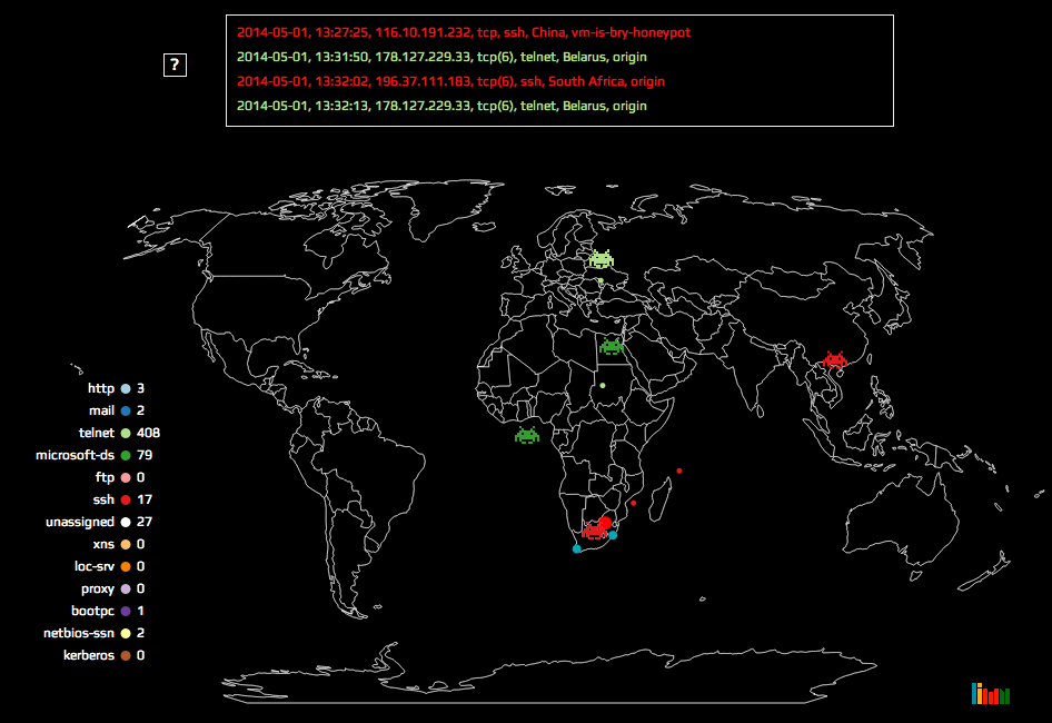 Attack maps are becoming a more common data visualisation with some great examples that have been doing the rounds here, here and here. I tackled a similar project that has been put on hold for now, but I really enjoyed making the map and I think its a fun interpretation. The version I put up shows the attack data for 1 May 2014.
Birthday Graph for South Africa
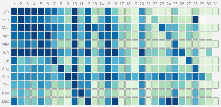
One of the projects I worked on in 2013 gave me access to a large list of South African ID numbers. Since the South African ID number encodes the person’s birthdate into the first 6 digits, I realised it would be possible to make a South African version of this map of common birthdays in the US. I grabbed digits 3 – 6 (month and day) of each ID and discarded the rest to be safe. From there, its was simple enough calculate the frequency distribution. The US map only shows the ranking, not the actual distribution and so I have made an interactive version that does both:
Internet Devices Map
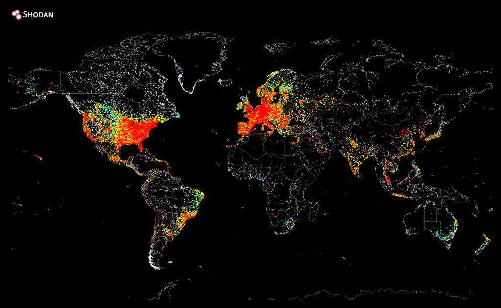
Shodan recently created a heat map of all the devices connected to the internet. Sadly Africa still has a long way to go 🙁
Seven Habits of Highly Fraudulent Users
One of the key attributes of good data visualisation is that it tells a story. The pictures can bring a narrative to life in what would otherwise be lost if you are just looking at numbers. This post from Sift Science is a great example of that:
http://blog.siftscience.com/seven-habits-of-highly-fraudulent-users/
Those Wacky Cartographers
In 1988 the Proclaimers unleashed the song I’m Gonna Be (500 miles) on an unsuspecting pub song singing audience. It quite likely the created the first song in the world that if you were caught not singing along to the chorus, you would be ejected from the pub and publicly shunned until it was your round.
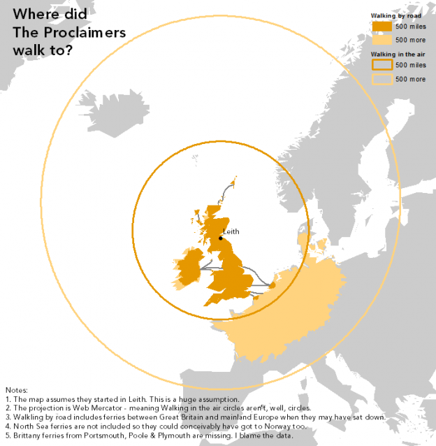
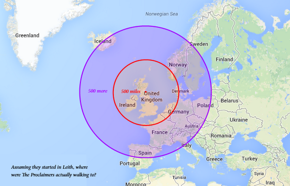
That song did get me to think about what it would be like walking 1000 miles (500, and then 500 more). That’s about the distance from here to Cape Town, which is an uncomfortable flight or a very dull, tiring drive. Walking it would be madness. For the Proclaimers, who presumably started in Leith, walking 500 miles in any one direction poses a logistical problem. Enter the cartographers. The first map exploring this problem would have been how I would have looked at it too:
Beard Attractiveness Graph
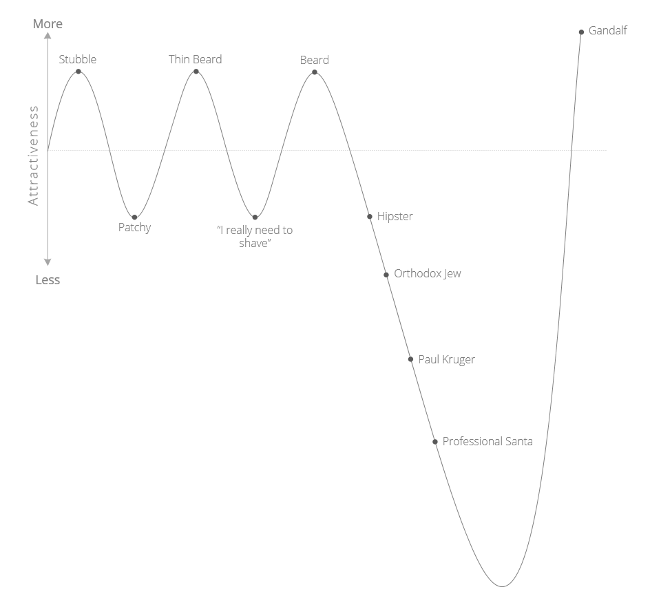
On one of my recent internet wanderings, I came across a very awesome Beard Attractiveness Graph. It needed some design TLC and localising for a South African audience, so here is the do-over.

