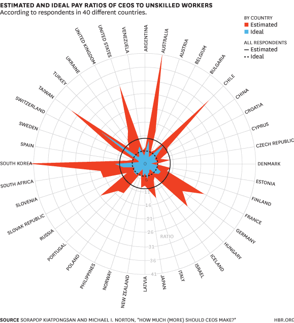
One of the things that data visualisation people like to do is point out how bad pie charts are. Its the first thing you do to show off your data viz chops. The example below from Apple being the prime candidate of a misleading pie chart. Continue reading “Pie Chart Nazis”
Month: April 2015
The Reddit Universe
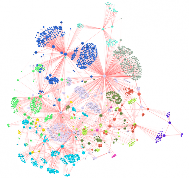
This picture of what interests reddit has been doing the rounds recently. Its a fairly large network graph showing the links between the different areas of interest of reddit users. The detail of the article is interesting on its own, but what this highlights for me is the difficulty with using large network graphs to convey information graphically. Since you have to keep zooming and moving around, you keep adding new location and context information to working memory fairly frequently, and something will fall out. Like when Homer Simpson’s took a wine making course. Continue reading “The Reddit Universe”


