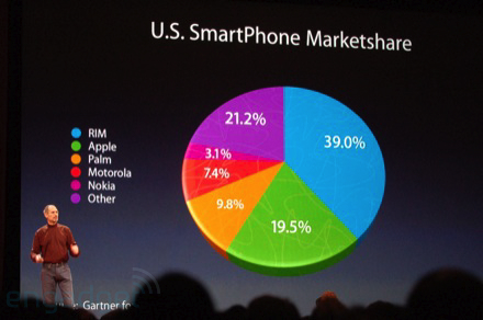
One of the things that data visualisation people like to do is point out how bad pie charts are. Its the first thing you do to show off your data viz chops. The example below from Apple being the prime candidate of a misleading pie chart.
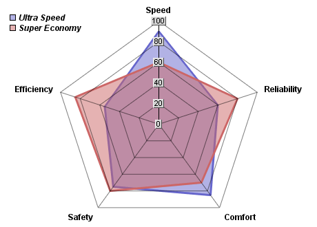
However, the wonderful people at Dark Horse Analytics have done a great article showing the evils of radar charts, and how they can be even more misleading.
While I do agree with them in this particular case, I have often found radar charts to be a good at-a-glance way of determining differences between entities. Specifically if the measurements are less purely quantitative and there is some overlap between them.
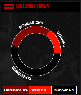
I was hoping to find an example of EFC MMA fighters, who used to have a radar charts for their fighters as a good example. But they have since removed these it gone with this instead: