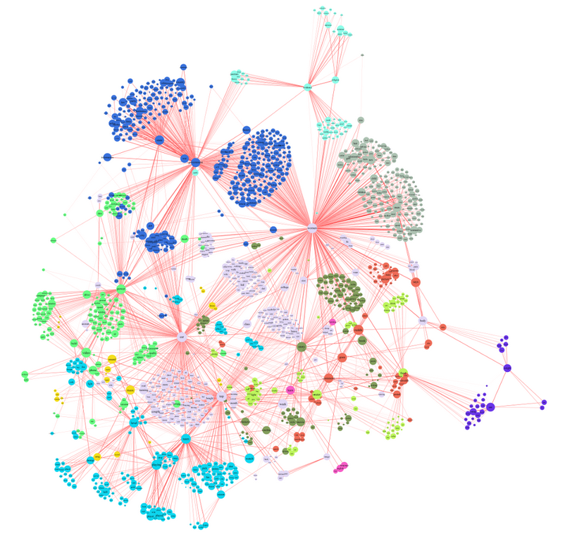
This picture of what interests reddit has been doing the rounds recently. Its a fairly large network graph showing the links between the different areas of interest of reddit users. The detail of the article is interesting on its own, but what this highlights for me is the difficulty with using large network graphs to convey information graphically. Since you have to keep zooming and moving around, you keep adding new location and context information to working memory fairly frequently, and something will fall out. Like when Homer Simpson’s took a wine making course.

I don’t know what the best alternatives are though, sometimes it best just t follow the Ben Shneiderman Visual Information-Seeking Mantra: “Overview first, zoom and filter, then details-on-demand.” One of the more interesting approaches I have seen is called BioFabric, that takes a more structured approach, but its still difficult to remember where you are once you zoom in.


