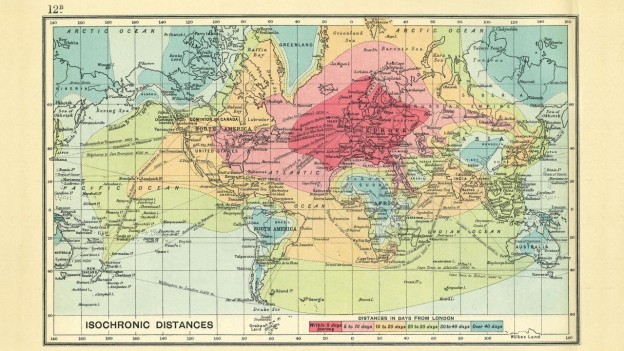
I love old timey world maps. Cartographers have understood the science of data visualisation for a long time and some of these old hand drawn maps are truly incredible works of art. This map shows the average travel time (in days) from central London to another part of the world. 10-20 days to get from London to South Africa. Its the journey, not the destination man! Plus there was probably more leg room. Thanks to @BrianPinnock for the original link.
Month: November 2015
Your Vote is Needed
The IIB awards have opened voting to the public. Since I’m on the shortlist, I figured I would make an impassioned plea to all 4 regular readers of this site to please cast a vote for me. Continue reading “Your Vote is Needed”
IIB Shortlist
I made it. Look out WSJ and Economist. Continue reading “IIB Shortlist”
Shameless Self Promotion
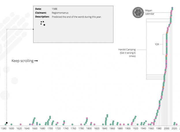
Its been a good week. I have had my Timeline of When the World Ended data viz shared on Flowing Data and accepted into the Information is Beautiful Awards’ Long List. Go team Limn!


