Jason posted yet another awesome edition of the Naked Data newsletter (which you should all definitely be reading). In this particular issue (#75) there is article entitled: Automatically generate beautiful visualisations from your data. Although there is a lot of snark in that title, the author is basically saying that good data visualisation is difficult and requires someone with training and experience if you want a decent end product. It is a sentiment that I completely agree with. The article then goes on to list examples of where an untrained amateur can not compete with professionals. Specifically movies, music and writing. And again I agree but I also think that most people who make horrible data visualisations would also agree with those 3 scenarios. Giant budgets notwithstanding, the problem here is that the barrier to entry to making your own data visualisation is very low (you just need a free online spreadsheet) combined with the lack of understanding of what goes into making a good data visualisation. Its problem that is big enough to have spawned websites to show just how bad some data visualisation can be.
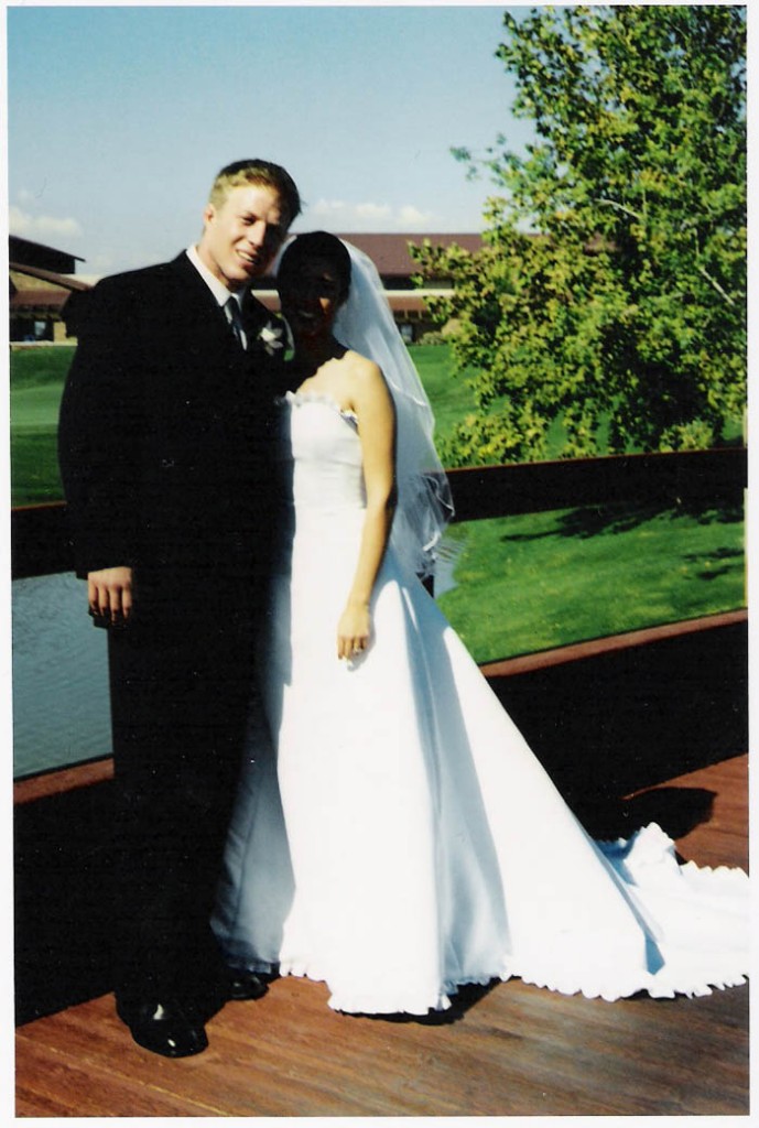
I think an analogy that better explains the issue is what I call ‘the wedding photographer problem’. Taking good photos at your wedding helps to capture the event in a way that retains the emotion and that special something that made the day important to you. But good wedding photographers are expensive. They have loads of expensive gear, they understand the technical requirements of lighting and camera settings, they know what goes into good composition and where to stand to get it and they have a lot of experience doing just this very thing. What may just seem like someone standing around taking photos is the culmination of many years of experience plus the post processing photoshop work to get you the kind of photos you would want. However it does just seem like someone standing around taking photos, and we all have phones with cameras on them now and we have all taken photos.
Now, if you have a friend who has a slightly more expensive camera (i.e. not an iPhone) and has watched a couple of Youtube videos on how to take wedding photos, the thought of saving on the cost the professional photographer is very tempting. You might look at some of your friends pictures of sunsets and flowers on Facebook and be happy enough with the results. But it is unlikely to come close to looking as good as the work done by a professional.

Source: https://www.allisterfreeman.co.uk/

Source: http://www.deathandtaxesmag.com/192071/40-of-the-worst-wedding-photographs-youll-ever-see/
The photos above come from two quick web searches for good and bad wedding photographs. These vary dramatically, but I’m sure there are some photos that look okay to me but would not meet the standards set by professionals. In the data visualisation world, graphic designers and your local BI team represent the friend who is a keen amateur. Hopefully they are good at what they do, but data visualisation is a specific skill with specific experience needed to get good results. Most of the viz.wtf posts look like work done by graphic designers who simply ply their trade on something where they don’t know that there are rules to follow to make it work.
Outside of wedding photography, the issue is reasonably managed. Professional industries use professional people to do the work. Ad agencies use professionals photographers for model shoots and product pictures and newspaper and magazine editorial staff know that they get better pictures from professional photographers. Similarly, the bigger news websites, newspapers, magazines and creative agencies use professional data visualisation practitioners to get the best work done.
At the same time you don’t need a professional photographer to capture your night out with friends, your kids latest sports game or similar event that you can capture just as well with an iPhone. Presenting the latest sales numbers to your team, or whichever KPI it might be, does not need a professional data visualisation, just use Excel. But if this going to be published and scrutinised, if you are wanting to persuade someone with your data or if this in anyway going to be representation of you to the rest of the world something, use a professional.


