Posted in August 2016
Limn: one year of Comrades training
On a recent job at Discovery to do some analytics for Vitality, I was looking at data that is recorded into their platform as part of their insurance linked wellness program. There are various activities that are tracked as part of the program and a fair amount of it is running data. Given the size of their customer base it's fair to assume that many of them have run the Comrades Marathon, and I wanted to see what all those runners' various training programs looked like.
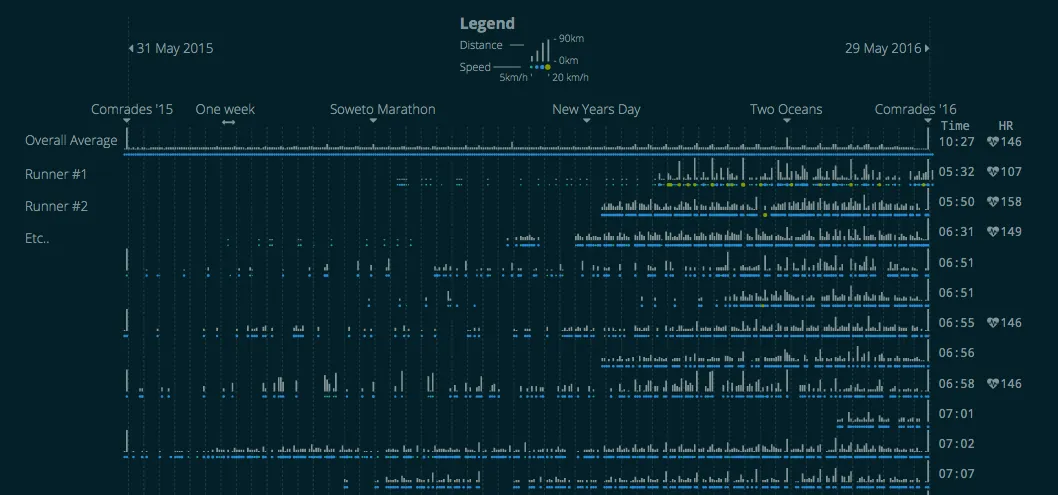
The picture above is the narrow version (1024 wide). There is also a wider version (1920 wide). Please be aware that this is calculated and rendered using D3, so it takes a while to load.
With Discovery's permission I grabbed a set of anonymised data of recorded activities, which included date and time, distance run, average speed and, for some runners, their average heart rate. This was trimmed to anyone who had run at least one run greater than 80km, to reduce it to Comrades-only runners, which resulted in a list of 1030 runners in total.
The visualisation is designed to compare the distance and speed between different runners on different days of the year, which makes it visually quite dense but allows for a quick visual comparison between runners.
Each row represents one runner's data, for one year, starting with the Comrades marathon at the end of May 2015 and ending at the Comrades marathon at the end of May 2016. At the end of the row you can see the runner's calculated completion time and average heart rate (if it was reported) for the 2016 Comrades. Each column represents one day, showing the distance run (the vertical line) up to 90km and the speed of the run (the dot below it) ranging from 5 to 20km per hour. The top row shows the median value per day across all runners and the rest of the rows are sorted according to finishing time for the race.
The colour scheme is based on solarized, which is quite commonly used for text editors. The reason for having two versions, wide and narrow, is mostly just the sheer number of elements. It has to render over 750,000 little SVG elements, and redrawing that takes a long time.
What the data looked like
There were very few complications with the data. There were some split readings that had to be aggregated, sometimes the speed or distance was too fast or too far to be realistic and had to be excluded, or the runner didn't actually run the Comrades this year. Also some of the rows don't seem quite right. The very first runner seems a little inconsistent and their heart rate is low. Overall the data quality was great.
What it shows
I was hoping to find some easily discernible patterns that show how people train, so that if you followed their regime you could do a better time. But there is nothing visually obvious here. Some people run far, some not, some people run almost every day, some just on weekends.
There is also some data that's missing. While some runs might not get recorded, the bigger issue is that some people either picked a hard New Year's resolution, or they got a run tracker for Christmas and only started recording the data at the start of January 2016. The counts of recorded runs increased after the New Year. You can also see which are the more popular training runs, and specifically how many runners did the Two Oceans.