One of the attributes of really good technology is that it hides the complexity of what goes on in the background, while still being useful. Depending on how old you are, you may remember having to set up a TV by selecting UHF or VHF with a little switch and then slowly turning a dial until a picture appeared out of the fuzz. Then you’d adjust the “bunny ears” aerial, and twiddle the tuner again to see if you could make the image even better. Continue reading “The Hard Problem of Data Analytics in Africa”
Month: October 2016
Really Old Data Visualisation Book
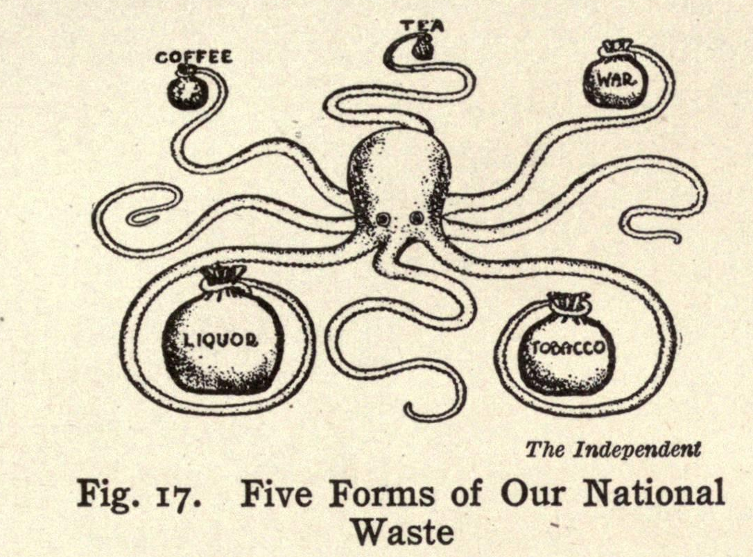
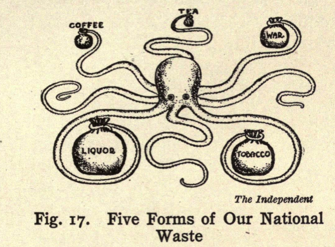
If you are into this sort of thing, Microsoft and the Internet Archive have digitised a copy of the 1919 epic Graphic Methods for Presenting Facts by Willard C. Brinton. While not one of the original seminal works, it still shows that the thinking that goes into basic information display is a lot older than we generally assume. And it has some very cool illustrations, which today would get you a post on viz.wtf.


