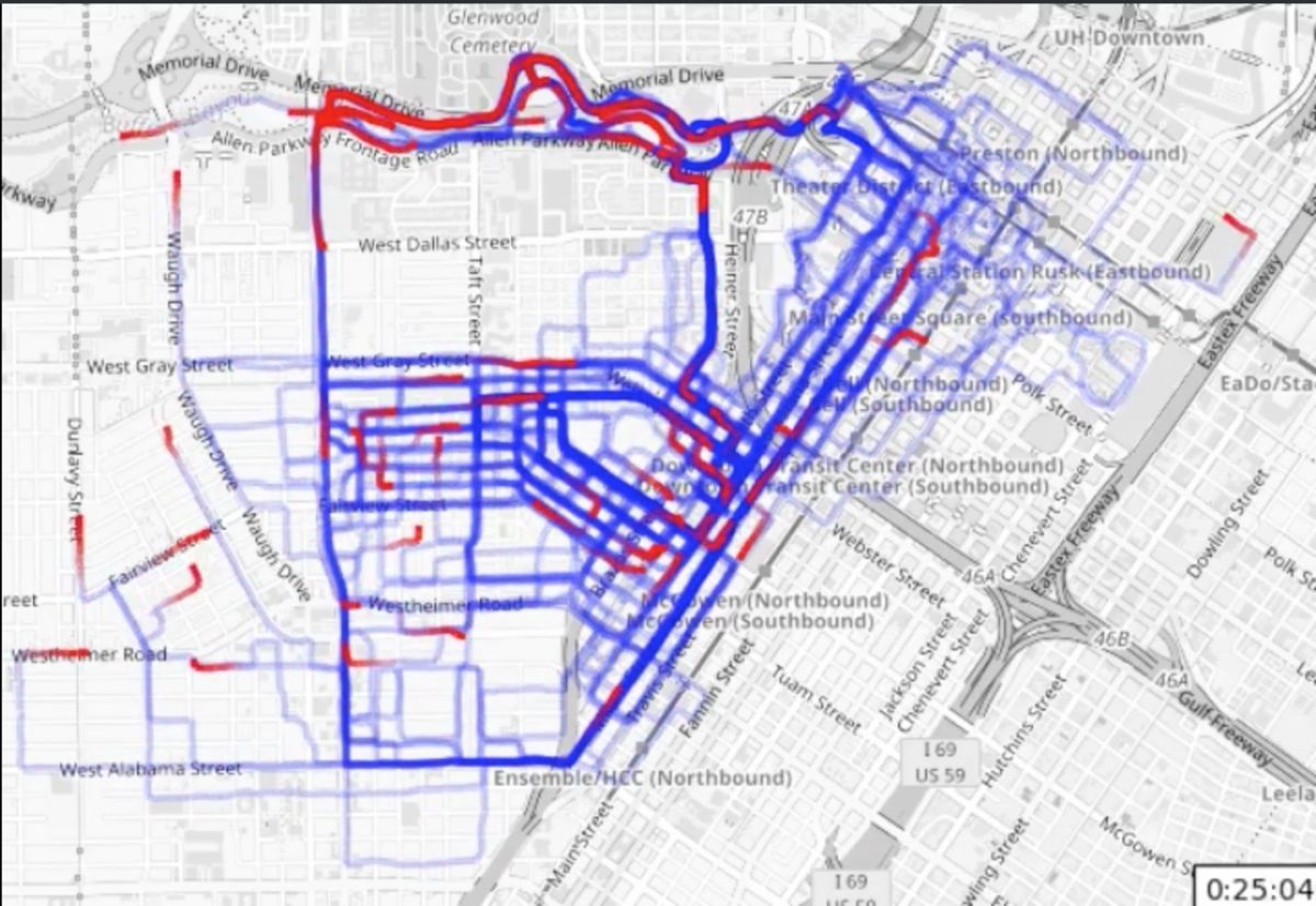
Speaking of visualising running, the graphic below is 2 years worth of running in the same area, overlaid into one handy animation. Its from this reddit post and is quite fun to watch.
Month: February 2017
2016 Berlin Marathon Data Visualisation
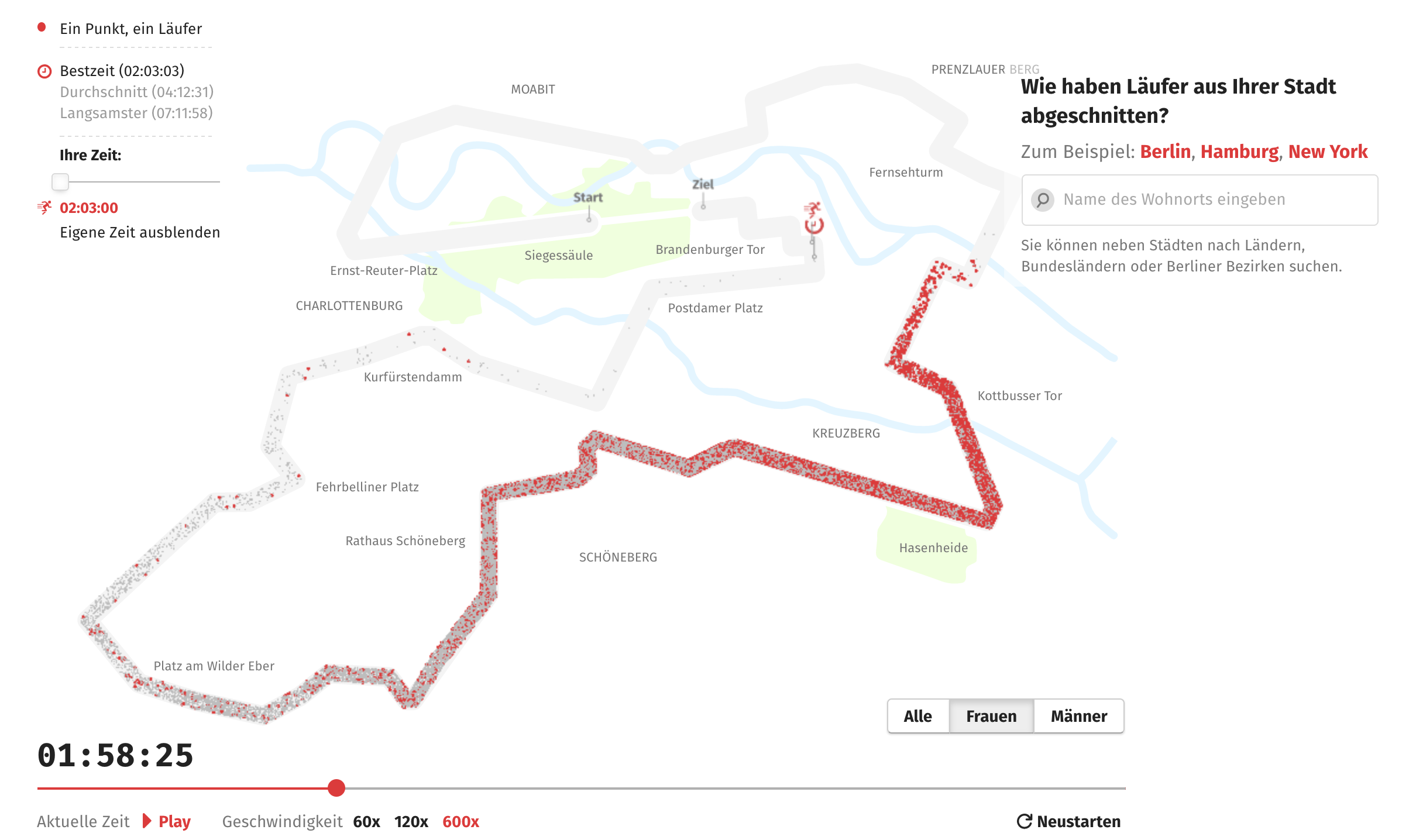
I do like a good marathon data visualisation, I really do. And this one of the 2016 Berlin Marathon is particularly nice.


