Posted in February 2017
Limn: the 2016 Berlin Marathon, visualised
I do like a good marathon data visualisation, I really do. And this one of the 2016 Berlin Marathon is particularly nice.
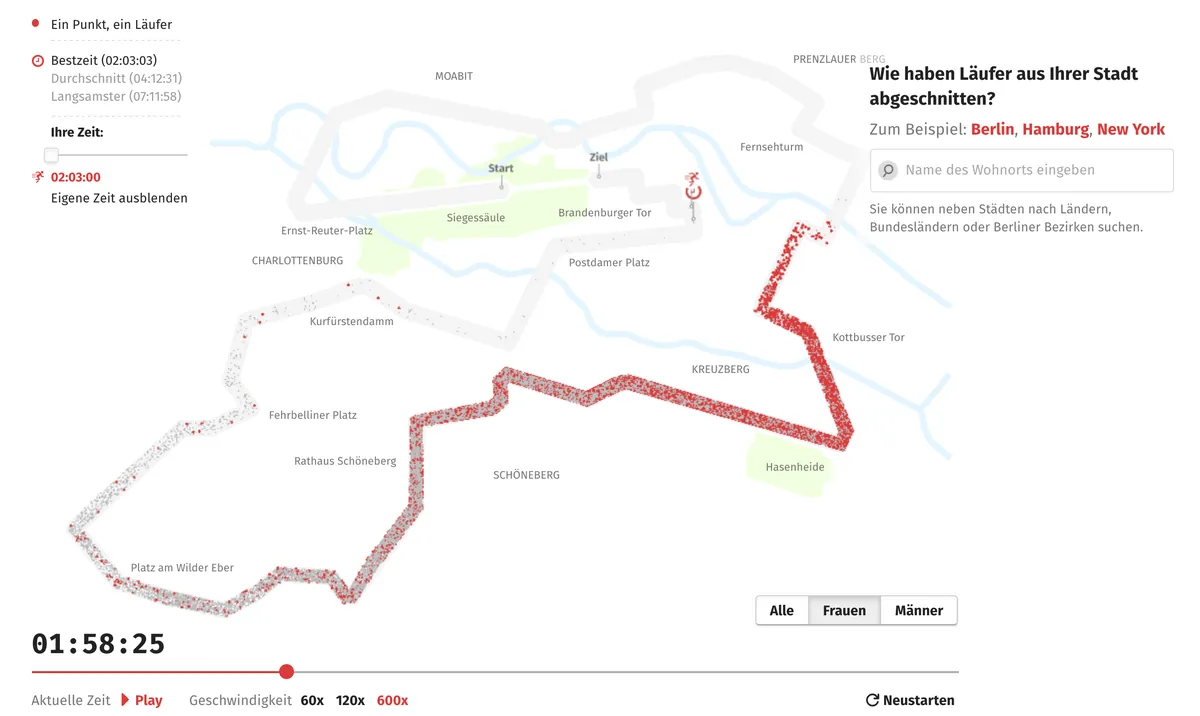
It gives a good sense of the spread of the field, and if you were one of the runners, you can see how you did compared to everyone else. This is definitely not a standard bell curve.
This is built on an engine called PixiJS, which I will admit is new for me. (Yet another JavaScript engine to add to the pile of things that I should probably learn about, but probably won't.)