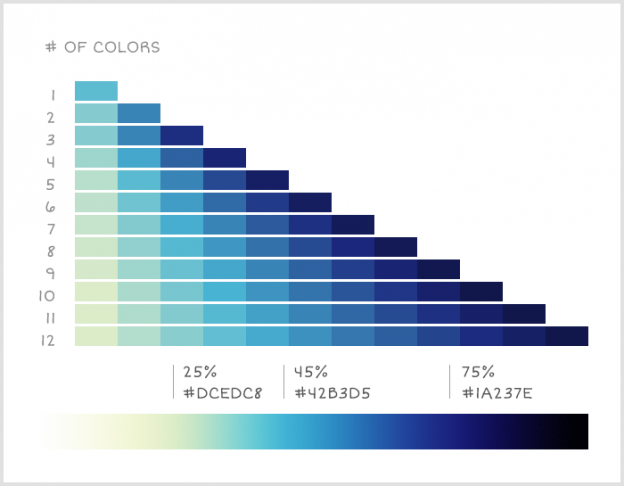
When creating a data visualisation, one the worst ways to encode the differences between values is to use changes in colour. Whether going from light to dark or changing between two colours, our brains are not particularly good at determining how big the difference is and for small differences, we may not notice it at all. Continue reading “Colour Palettes for Data Visualizations”
Category: Visualisation
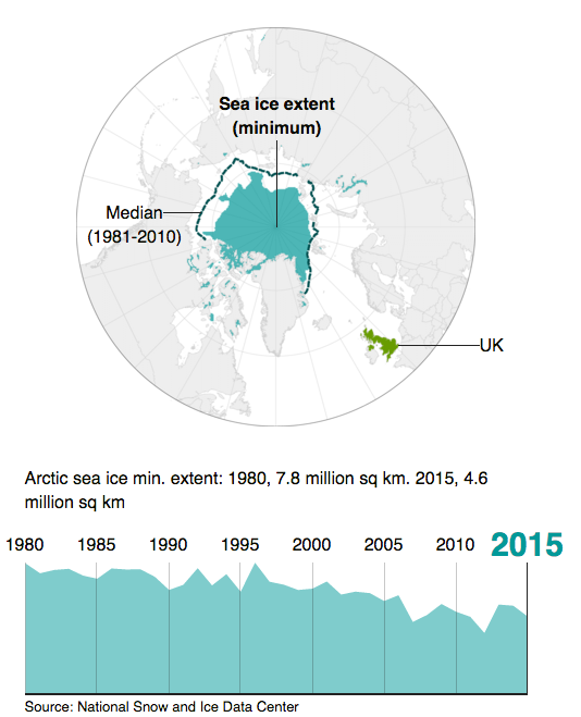
Climate Change in Six Easy Graphics
One of the key requirements for good data visualisation is that it supports the narrative of the issue being explained. It should support the story by helping the reader easily understand the conclusions drawn from the data analysis. In some cases the data visualisation carries the story complete as in this article from BBC News: Six graphics that explain climate change
Your Vote is Needed
The IIB awards have opened voting to the public. Since I’m on the shortlist, I figured I would make an impassioned plea to all 4 regular readers of this site to please cast a vote for me. Continue reading “Your Vote is Needed”
IIB Shortlist
I made it. Look out WSJ and Economist. Continue reading “IIB Shortlist”
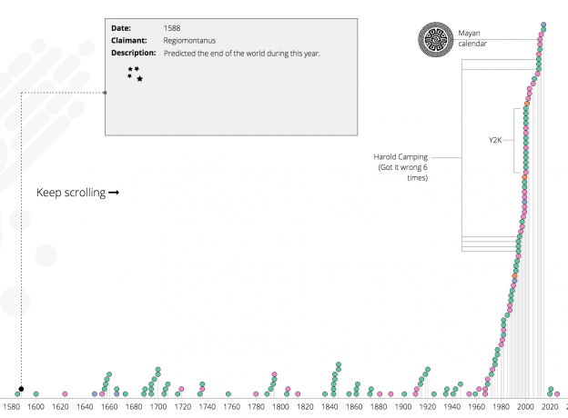
A Timeline of When the World Ended
A recent Naked Data newsletter pointed me to this article on wikipedia which gives a list of when the world was predicted to end throughout recorded history. Its a timeline of when the world was supposed to end, who claimed it would and how/why. It is wikipedia, so its as accurate and complete as wikipedia can be. I figured it would be a nice thing to see on an actual timeline, so here we have it. Continue reading “A Timeline of When the World Ended”
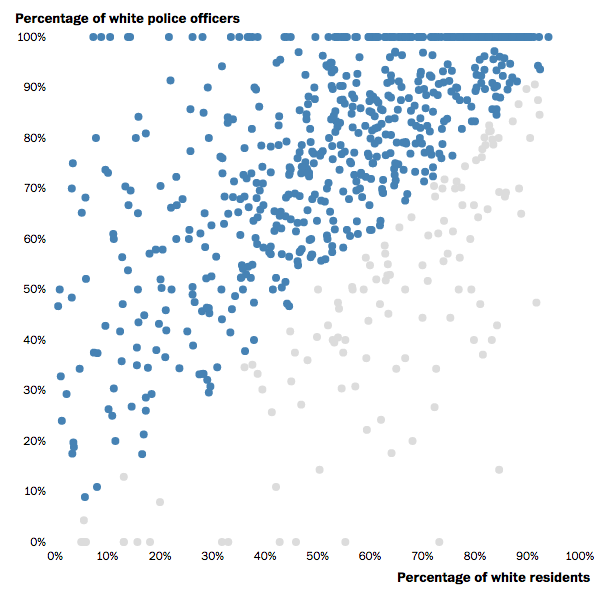
Racial Make Up of Police Force vs Community
This post in the Washington Post is a great example of using an interactive scatter plot to show varying proportions. Interesting story too. Continue reading “Racial Make Up of Police Force vs Community”
A really bad pie chart
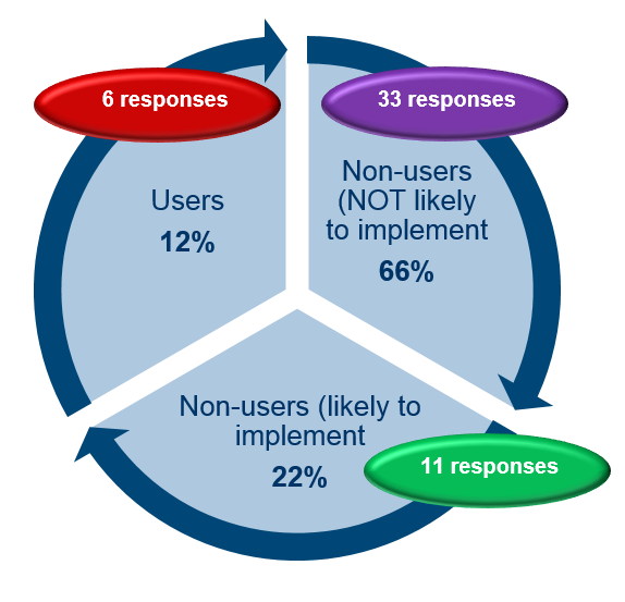
Pie charts are often maligned by the data viz community. Sometimes for good reason and sometimes to just to feel better by ridiculing those that don’t know you are not supposed to use pie charts. However there are those moments where something goes truly wrong. This has to be shared to prevent it happening again. Lets this act as a warning as to what can go wrong when you use PowerPoint without a licence. Continue reading “A really bad pie chart”
Visualising South Africa’s Imports and Exports
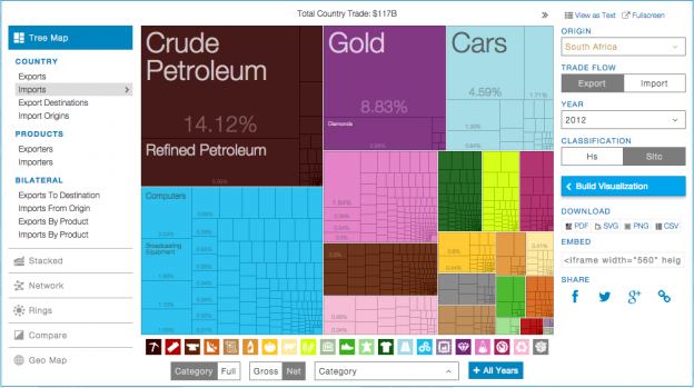
This is a great use of a tree map to show the breakdown of imports vs exports for South Africa. The last data point is 2012, but its still interesting to see. In 2012 we exported $20.4 billion and imported $10.3 billion worth of gold. Surely we could have just kept it half of it here and saved everyone a lot of time? Continue reading “Visualising South Africa’s Imports and Exports”
Visualising the London Underground
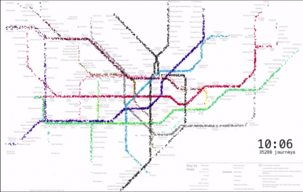
This is a great way to look at the total number of travellers on the London Underground on an average day. The audio that goes with it is very nice too! The one thing I would have liked to have seen would be the station entry/exit numbers to get a sense of the extent of an average journey. The data is here if you want to fiddle. Continue reading “Visualising the London Underground”
Data Visualisation Pioneers
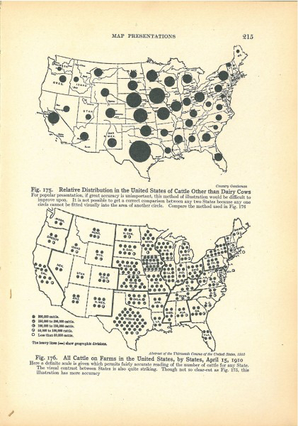
There is quite a deep history of Visual SenseMaking and it seems a lot of the work in advancing and documenting data visualisation was done by engineers. Fine people engineers. This article gives an interesting review of some of the unsung pioneers of the discipline and small diversion about Isotypes. Continue reading “Data Visualisation Pioneers”

