
Sometimes it doesn’t have to say anything, it just needs to look pretty. Continue reading “Javascript Canvas Art”
Month: January 2016
The Wedding Photographer Problem

Jason posted yet another awesome edition of the Naked Data newsletter (which you should all definitely be reading). In this particular issue (#75) there is article entitled: Automatically generate beautiful visualisations from your data. Although there is a lot of snark in that title, the author is basically saying that good data visualisation is difficult and requires someone with training and experience if you want a decent end product. Continue reading “The Wedding Photographer Problem”
Welcome to Limn
Limn (verb)
 1. Depict or describe in painting or words.
  - also: This site, dedicated to the art of data visualisation.
HTML Music Visualiser using D3

I have always dream of a world where all interactive software would work via the browser. But we still have people clinging to their desktop and mobile apps like some weird guy who believes the best years were when he was still in high school in the 80’s. An all browser world will use one programming language and is platform independent. Mostly.. Apart from when it isn’t. While we have a lot of web stuff now, some components have remained firmly out of reach and one that I have often wanted to experiment with is audio. Enter the <audio> tag. Continue reading “HTML Music Visualiser using D3”
The Infographic Awakens
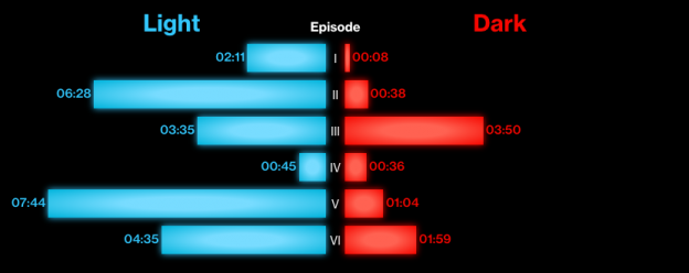
Since we are still in the grips of Star Wars frenzy (and the various problems in the world that need solving will still be there in tomorrow), Bloomberg created an infographic showing the use of the Force across all 7 Star Wars films. I like the adherence to the colour scheme and, since the data doesn’t actually matter, this if form over function that works well.
Mostly Desert
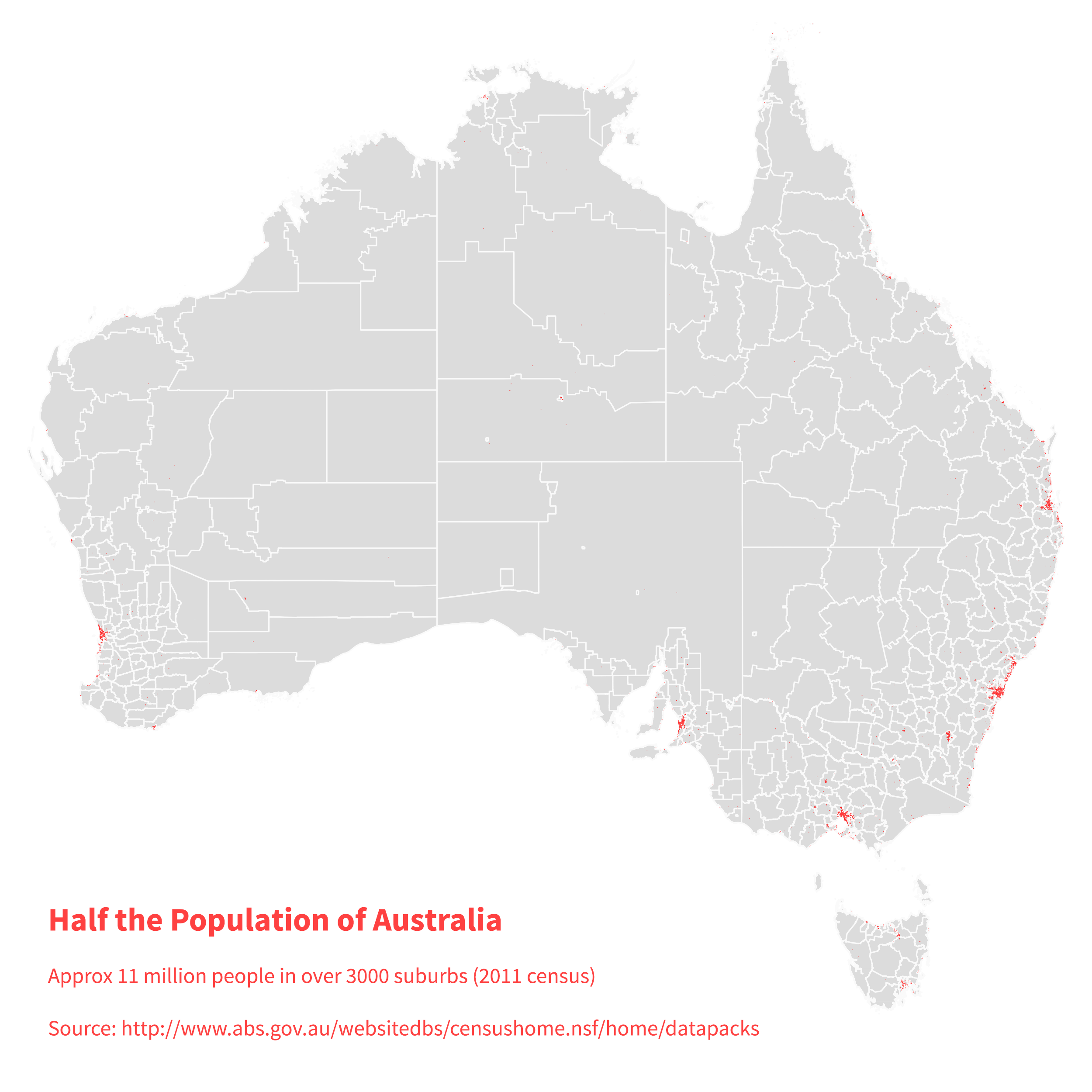
This picture shows where half the population of Australia live. Continue reading “Mostly Desert”
Colour Palettes for Data Visualizations
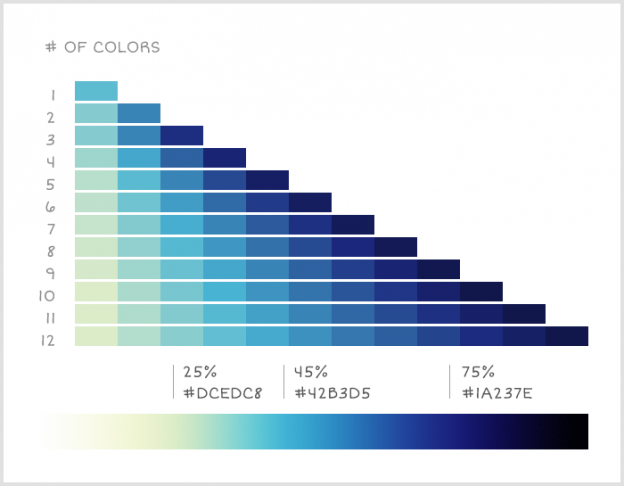
When creating a data visualisation, one the worst ways to encode the differences between values is to use changes in colour. Whether going from light to dark or changing between two colours, our brains are not particularly good at determining how big the difference is and for small differences, we may not notice it at all. Continue reading “Colour Palettes for Data Visualizations”
Climate Change in Six Easy Graphics
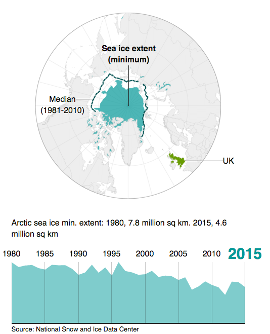
One of the key requirements for good data visualisation is that it supports the narrative of the issue being explained. It should support the story by helping the reader easily understand the conclusions drawn from the data analysis. In some cases the data visualisation carries the story complete as in this article from BBC News: Six graphics that explain climate change