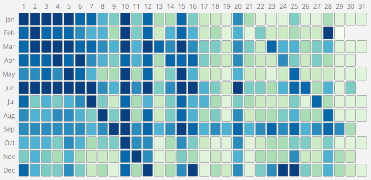
One of the projects I worked on in 2013 gave me access to a large list of South African ID numbers. Since the South African ID number encodes the person’s birthdate into the first 6 digits, I realised it would be possible to make a South African version of this map of common birthdays in the US. I grabbed digits 3 – 6 (month and day) of each ID and discarded the rest to be safe. From there, its was simple enough calculate the frequency distribution. The US map only shows the ranking, not the actual distribution and so I have made an interactive version that does both:
Category: D3
Markov Chains
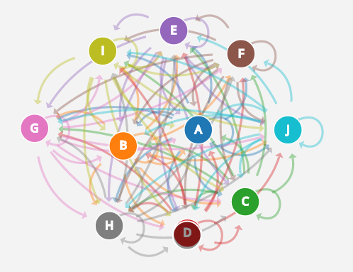
This is an amazing visual explanation of Markov Chains, built using D3. I really like the way the playground works. It lets you generate your own chains and watch as the complexity increases as you add more states.
To be fair though, I tend to enjoying watching D3 rendering algorithms generally. Its cheaper than satellite TV and works on my phone too 🙂
Thank you to Brian for the link.
Sorting Algorithms
Here is a video showing various sorting algorithms in action. And if you have time, here is Mike Bostock un-sorting things using d3.
Raspberry Pi Wall Display
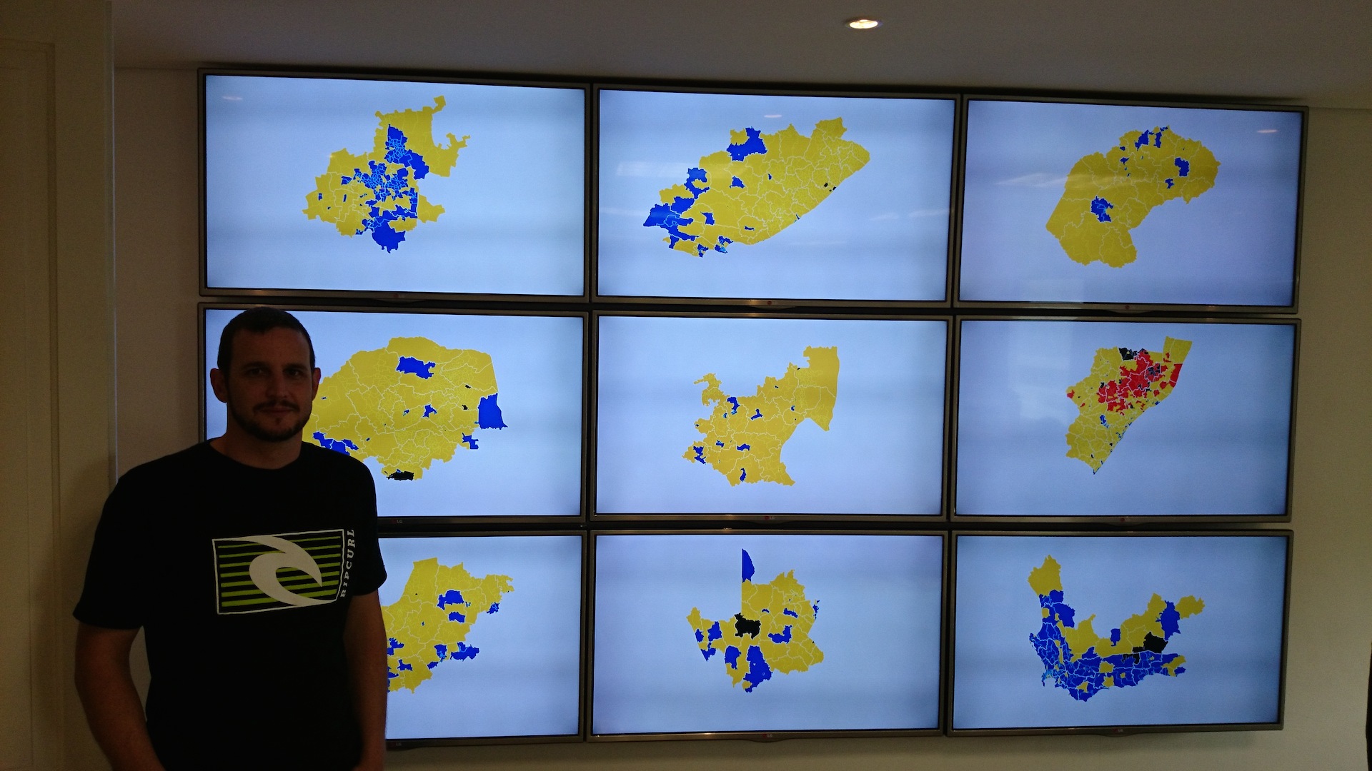
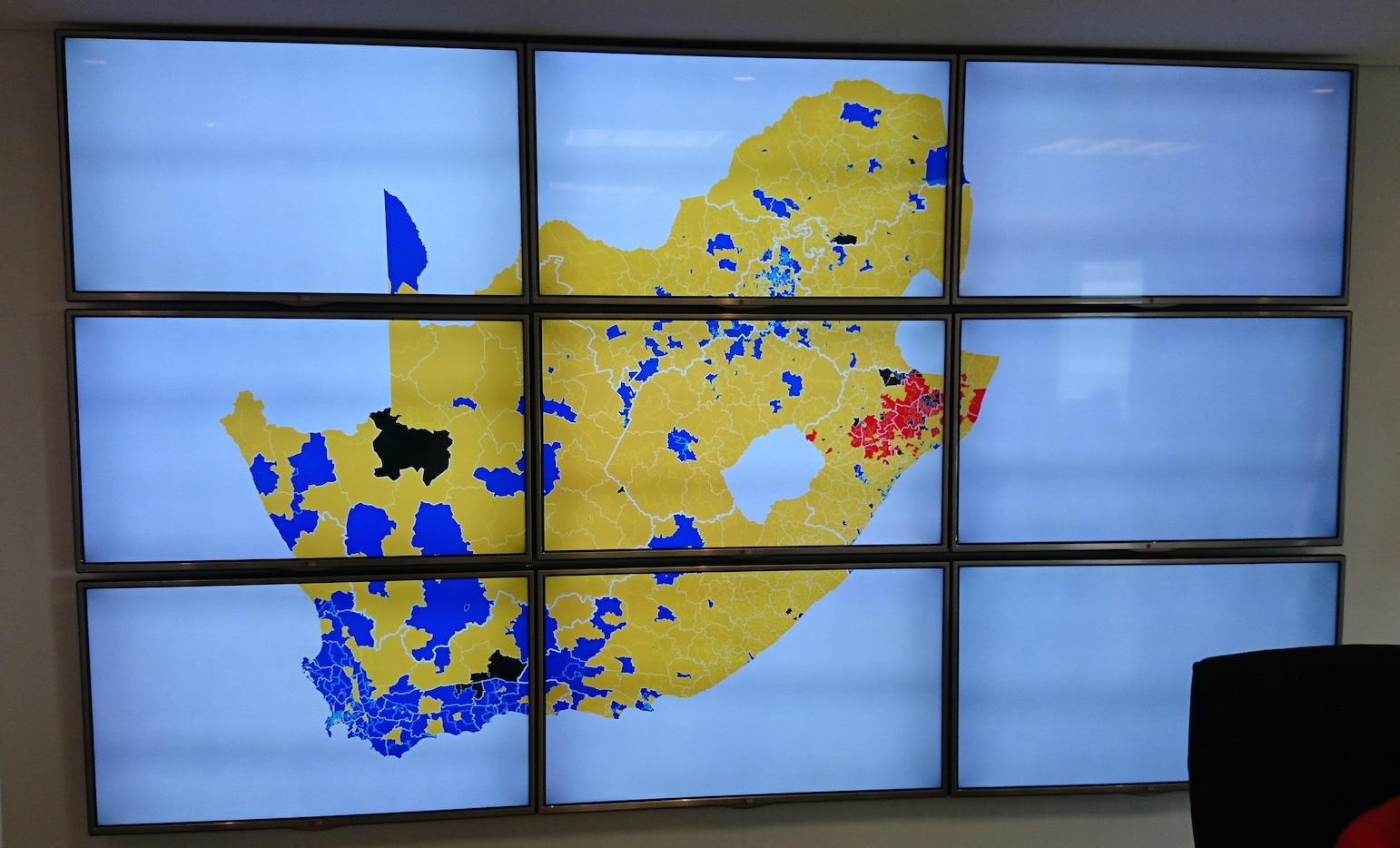
May was an interesting and fun month. I finished a project to build a big 3 x 3 TV wall display to be used at a call centre for the 2014 elections. The requirement was to have 9 screens all operating independently that can have individual images sent to each screen or a single image zoomed across all 9 screens.
Mapping Runners
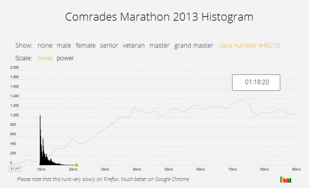
 I do occasional Park Runs and trail runs. On a recent run I started to wonder what the distribution or histogram of runners looks like. It would be a big moving blob at the start that slowly thins out as the faster runners pull away from the slower runners. The shape will depend on the race distance and the number of runners. I first did it for the Comrades Marathon in 2014, and now again for the JP Morgan Corporate Challenge. The shape will depend on the race distance and the number of runners. Continue reading “Mapping Runners”
Making a Cartogram
Mike Bostok has a fantastic tutorial on how to make a map using d3 and topojson. Having done some mapping work recently for a client, I was keen to learn more and try do a d3 based cartogram. I found some good examples of non-contiguous cartograms, but I wanted to make a South African version of a contiguous one using Shawn Allen’s d3 implementation.
Here is the final product, and I’ll take you through some of the tricky parts that I had to deal with.
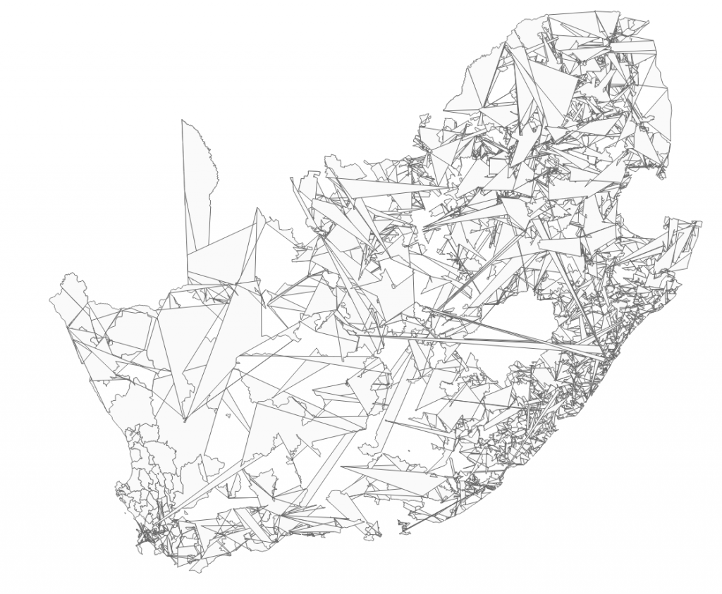
An Accidentally Beautiful Map
Visualising a DDoS attack
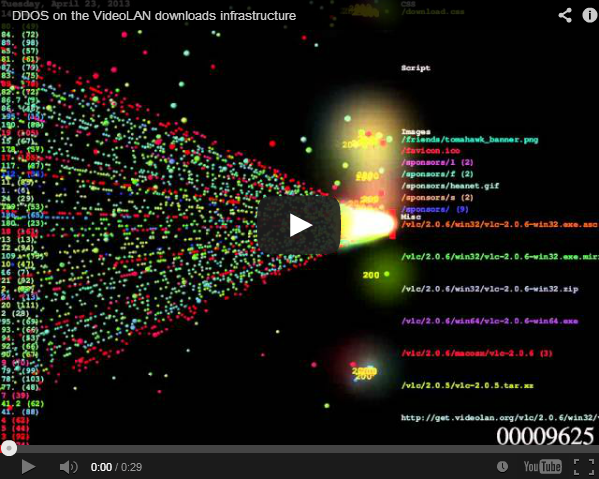
The makers of the very awesome VLC media player were recently the subject of a DDoS attack. They made a video that visualised the attack using a program called Logstalgia. Its very pretty to watch.
It would be interesting to correlate this data with a location map to see just how widely distributed the attack was, similar to this one I built for the Security Presentation.
Census Data

Building the Census Data Explorer required that I have the South African Census data in a format that worked easily with D3, i.e. JSON. I therefore had to get the data from the Statistics South Africa website and convert it into JSON format. I’m making it available here for you to use. Its not complete, just the data I needed for this project.
JSON Topology Maps
Updated: 23 Oct 2013
Most of my projects have been implemented using the D3 libraries and the D3 mapping components use GeoJSON and TopoJSON. When building the Census Explorer, I needed a provincial map of South Africa in GeoJSON format. Google didn’t know where to find any so I had to make one.

